Funderbeam
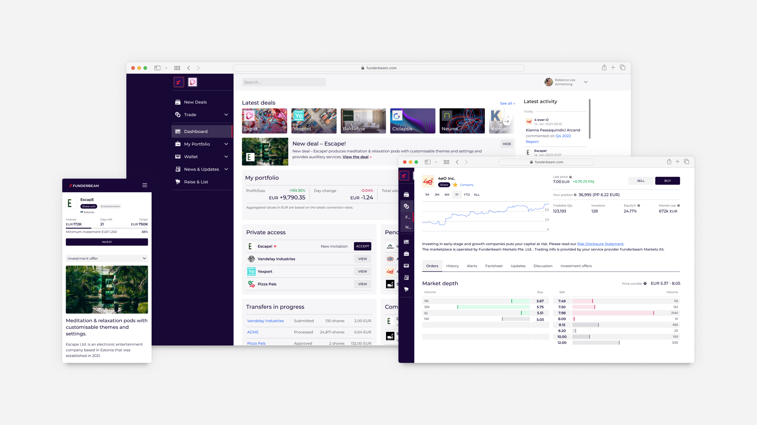
Funderbeam's product poses a challenge I think any designer just loves to tackle — how do you take something that until now has had a high buy-in threshold, both literally and figuratively*, and make it approachable for everyone? In this case investing and trading in growth companies on a platform not unlike any major stock exchange. Lucky me.
After conducting an inventory of all the different elements designed and added at different times, I set out to reduce the number of elements and unify their design.
I then built and helped maintain a Design System complete with a Figma UI kit, design tokens system, a reference site and processes around it to reduce the time it takes for product features to go from design to development and ensure consistency and quality.
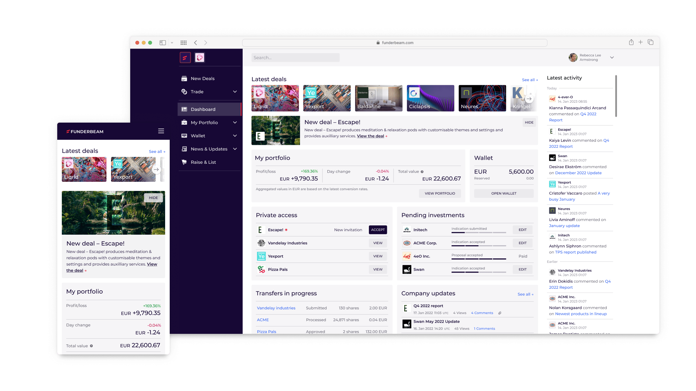
Iteratively refining and reusing the interface patterns – from layout to interactivity – and being very conscious about if and how to introduce new ones positively affected usability, reliability and speed of development.
The Market...
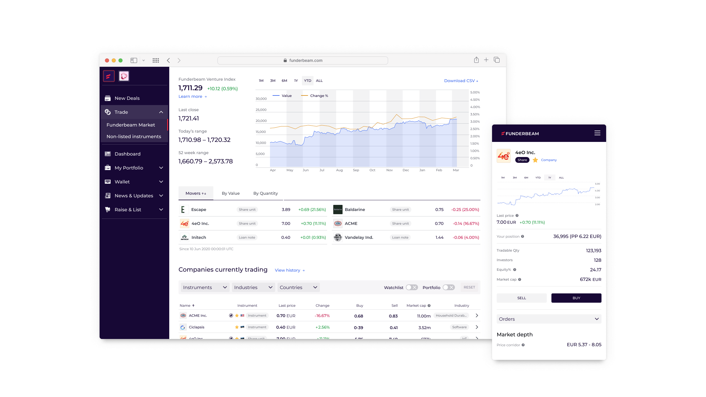
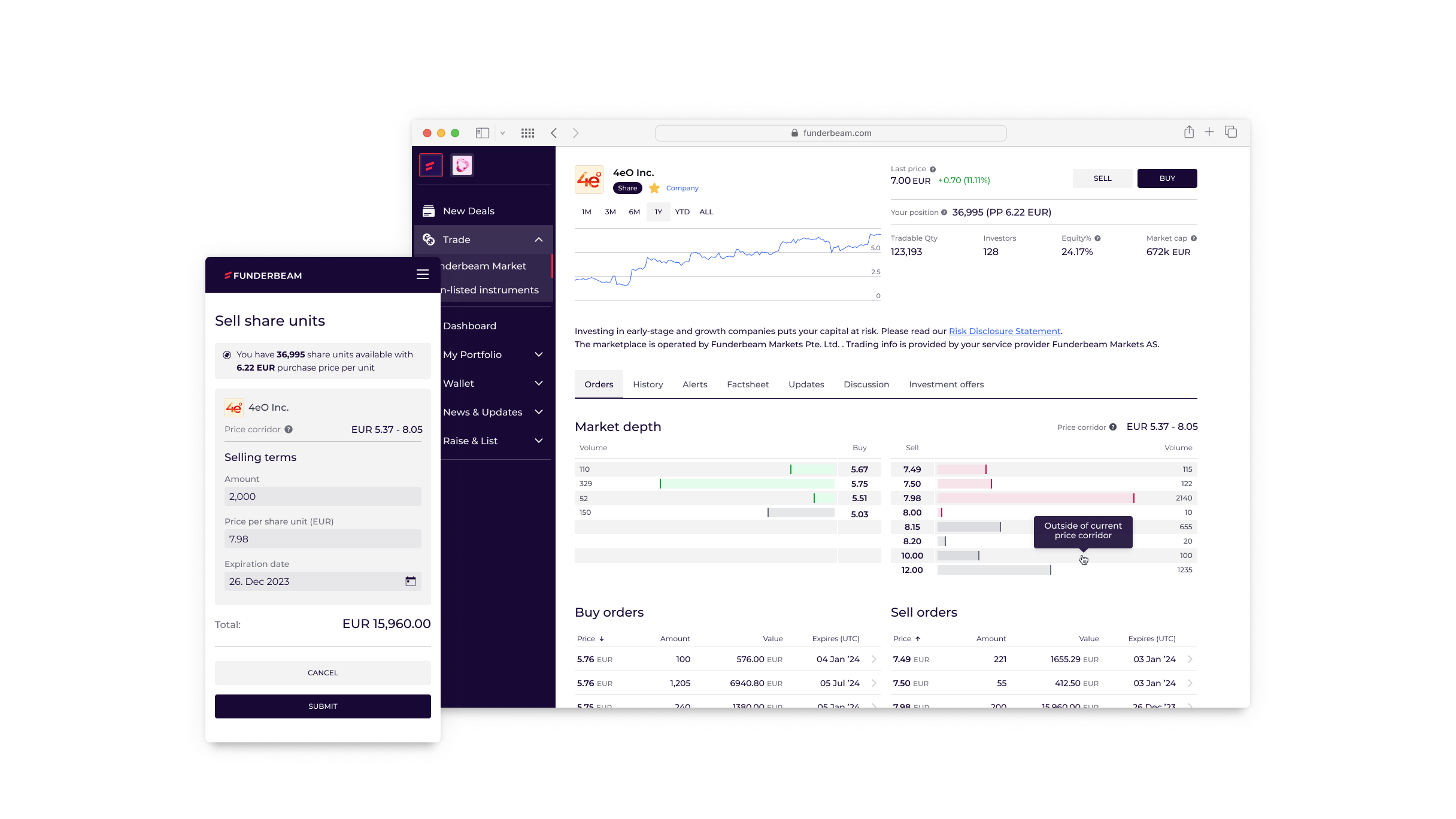
The Market product has seen many iterations to navigate the opportunities and restrictions of the complex compliance environment it operates in. Exchange interfaces are rather busy information-dense by their very nature and have an inherent learning curve. We aimed to bring it more to the middle of the road and leave the pro tools for the pros.
...and more
Just like the Market, all areas of the product were continuously iterated on and improved based on user feedback, changing business requirements and insight gathered along the way.
Iterating on the Dashboard based on user feedback and changes in other areas of the product that feed it. I was not looking to add things to it but rather keep the users’ current context in mind and surface relevant information.
Countless adjustments to the Funding product based on feedback from investors, investor networks, as well as startup founders looking to raise funds.
Keeping investors informed is a substantial overhead for companies – looking for ways to make it easier for founders to produce and publish regular reports and company updates to their investors.

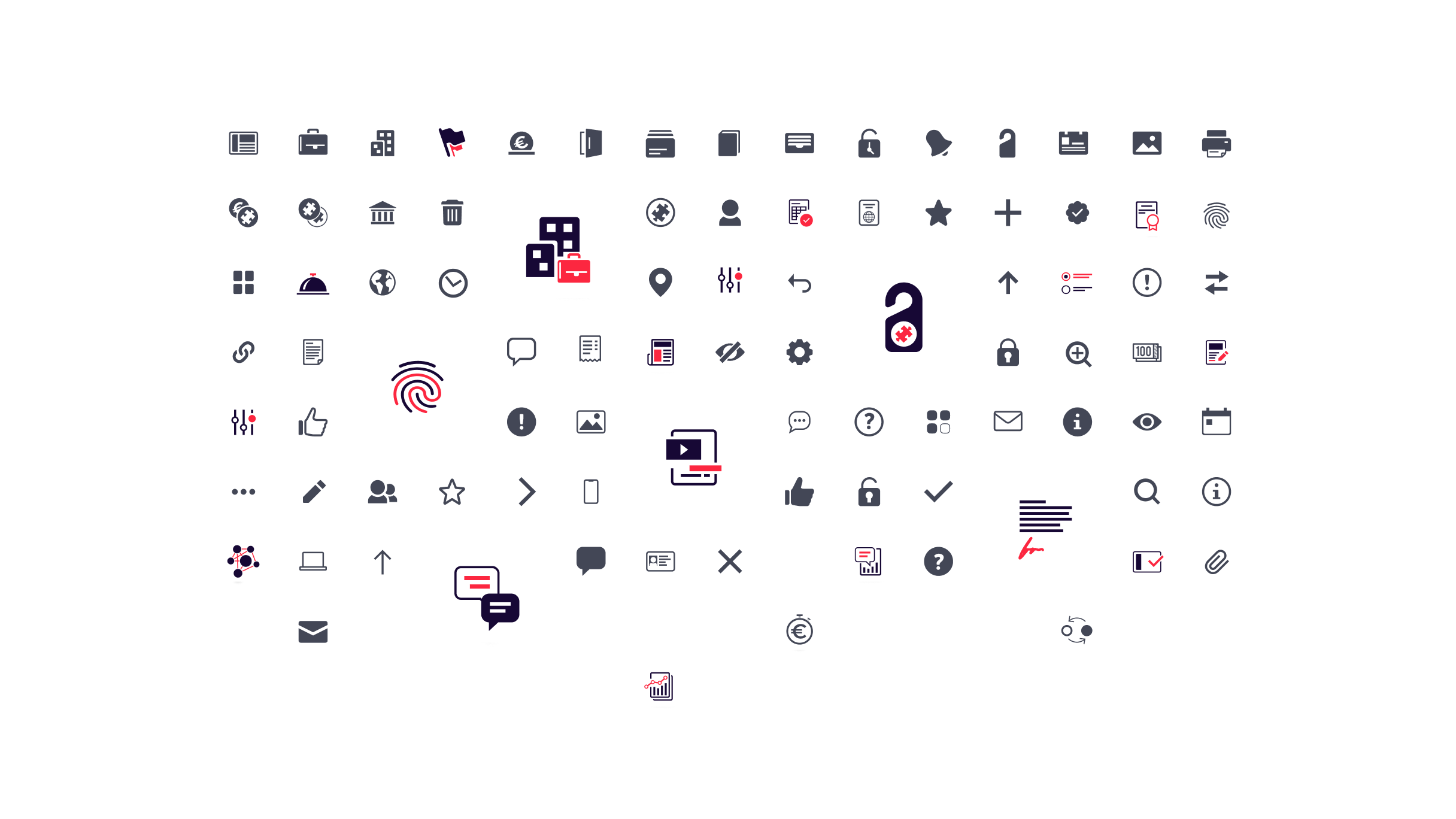
Off the shelf icons only go so far when you have a somewhat specific product and many of the icons had to be invented. I also introduced and implemented the SVG sprite technique as part of the Design System.
I also worked on refreshing the Funderbeam brand and supported the business across all teams as a Principal Designer.
*Investing and trading on stock markets usually requires either a deeper than average knowledge of the field or deep pockets.