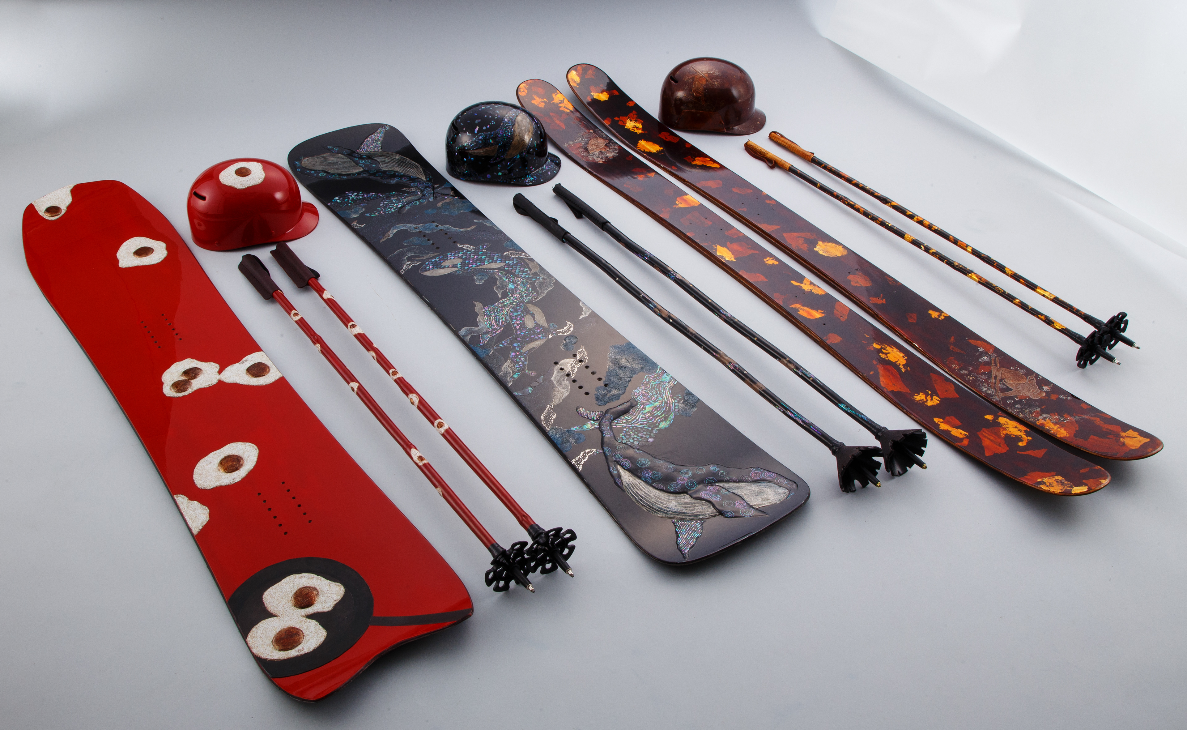
Snowboards and skis created using traditional Japanese urushi laquer by artist Sumire Morino.
via Spoon & Tamago
A running collection of things I’ve found interesting, well-made, or worth spreading—mostly from art, design, tech, photography, and film, with the occasional thought or two of my own.
Snowboards and skis created using traditional Japanese urushi laquer by artist Sumire Morino.
via Spoon & Tamago
Collected bits and pieces I’ve noticed this month.
I am gladly joining the chorus singing praise to Marcin Wichary’s Unsung blog. It’s unreasonably good.
~
“But the vast majority of the time, the single biggest problem you have is that nobody knows you exist, and nobody gives a damn about what you do.”
Anil Dash in Launch it 3 times
~
A video with every sample from Paul’s Boutique by the Beastie Boys.
via Kottke
~
I recently re-read and re-enjoyed these two interviews, one with Frank Chimero in The Great Discontent and the other with Wilson Miner on Staff Design. Both publications are no longer active, so fingers crossed these stay online, still.
~
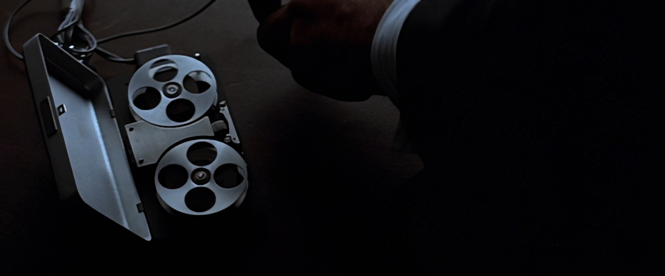
“The lost interview” with Steve Jobs.
~
Om Malik sadly passed away. In addition to his writing, I’ve immensely enjoyed his photography.
~
“As an adult, those books had turned into a phone, and reading turned into a thing I’d get to after I checked my “socials,” which never seemed to happen. And when I was reading, I was mostly reading a lot of industry books because I wanted to be good at my job. But that turned reading into a chore, which it had never been before.
Never turn your escape pod into a utility closet.”
Mike Monteiro, “How to read”
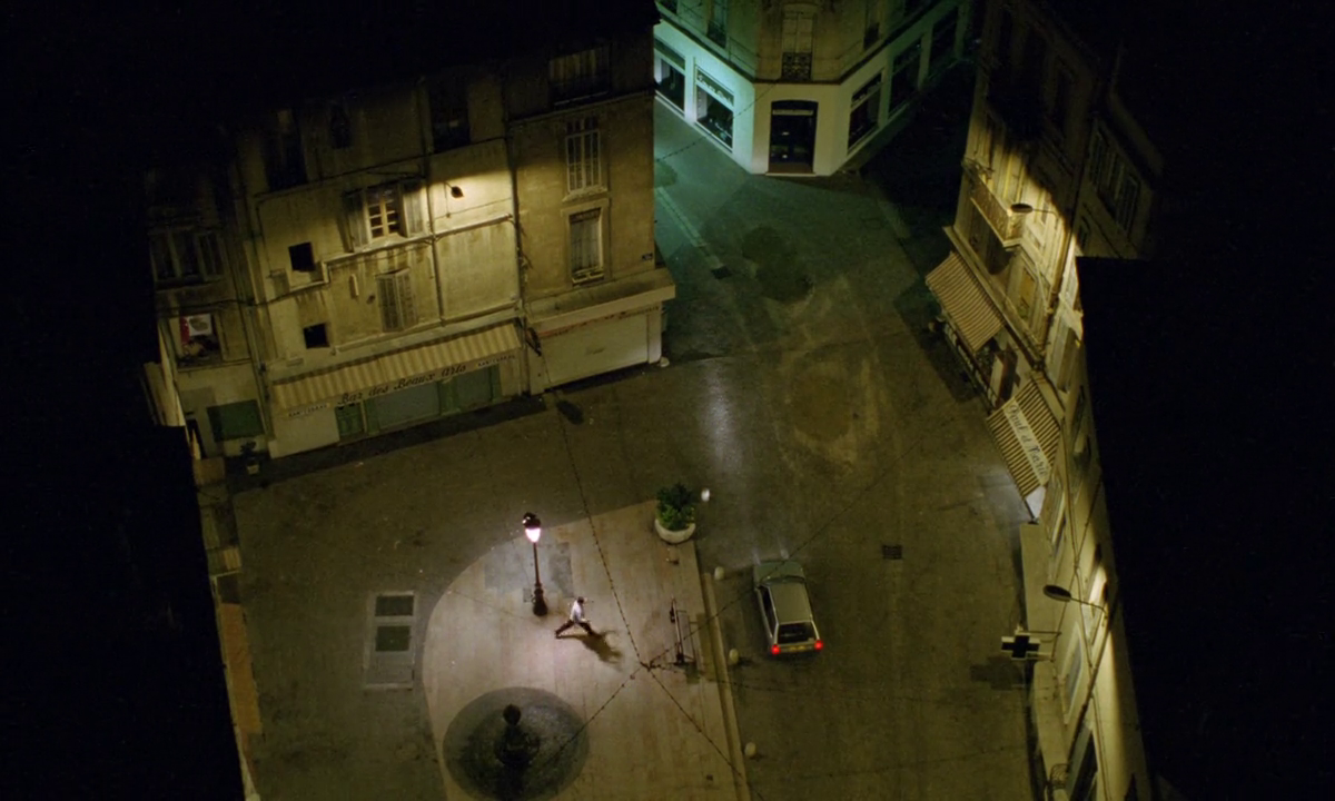
The Vanishing (George Sluizer, 1988)
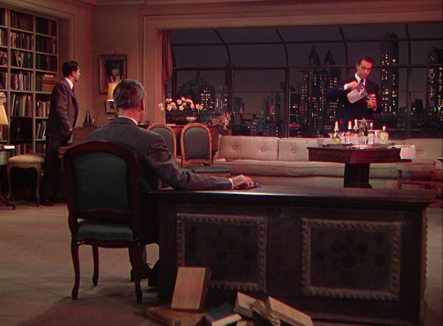
Rope (Alfred Hitchcock, 1948)
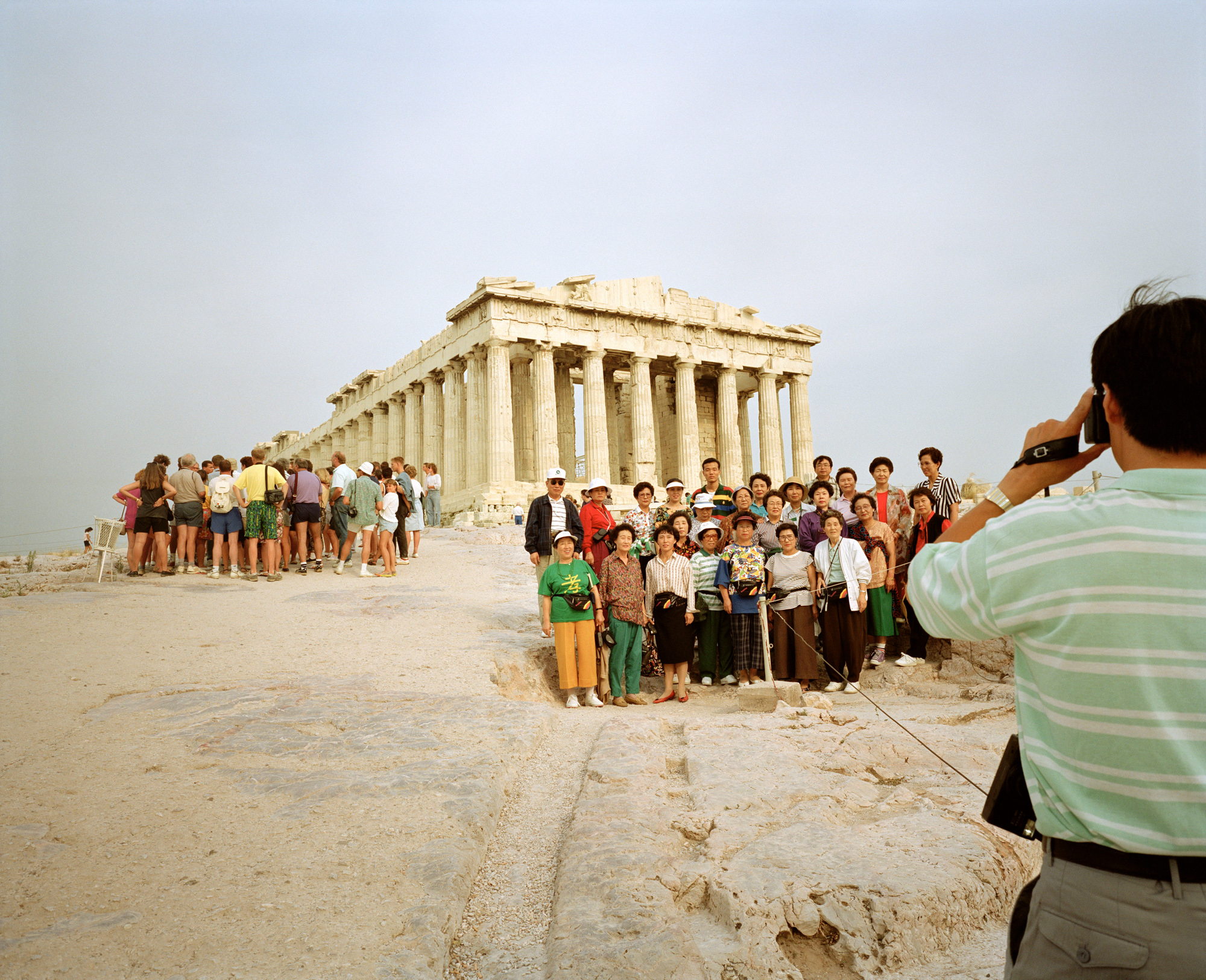
Acropolis, Athens, Greece, 1991. From ‘Small World’ © Martin Parr / Magnum Photos
via British Journal of Photography
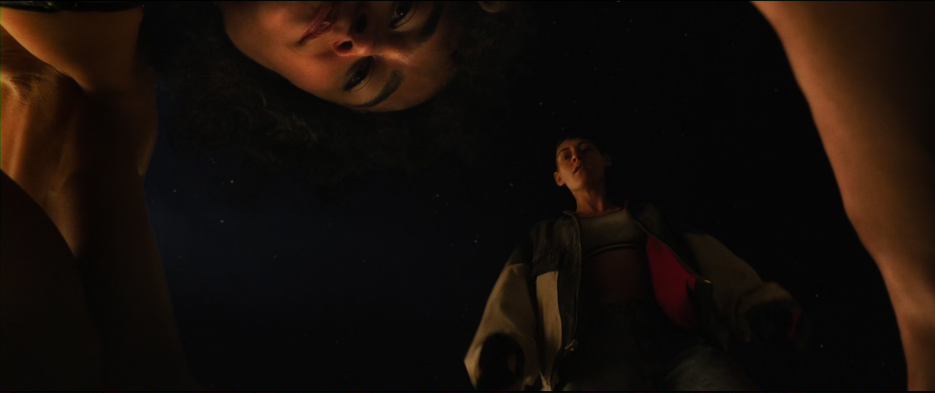
Love Lies Bleeding (Rose Glass, 2024)
Collected bits and pieces I’ve noticed this month.
Itnicethat interviews Hugh Miller who recently joined Pentagram as partner:
“Subtlety matters to me because it’s about leaving space for the audience to discover elements for themselves. I really believe that a piece of design should reward the second look, the slow encounter. Wit and beauty are the hooks, but subtlety is what keeps people engaged.”
~
Matt Ström-Awn on the possibly looming talent crisis in (digital product) design:
"Some argue AI will eliminate entry-level design work, making investment in junior talent pointless. This assumes design is just about creating screens and assets."
~
The search engine Kagi will not bill you if you don't use it. This is nice.
~
In Japan your garbage is your problem. Deal with it.
~
Frank Chimero offers up a way to shift how you think about and what you do with time.
~
Iconic (since demolished) Philly Love Park skate spot was faithfully recreated in Malmö, Sweden. The city has a skate coordinator, because why not.
What it says in the title – a Wikipedia list of common misconceptions about arts and culture.
This post by Frank Chimero on the seemingly implicit race to the bottom has many ideas that I find apt, but I find this one about ideas and the algorithm articulates what I have felt happening the most:
Good ideas don’t happen frequently enough to satisfy the pace of the algorithm, so many have pivoted to newsletters or stopped posting.
“Selling lemons”, Frank Chimero
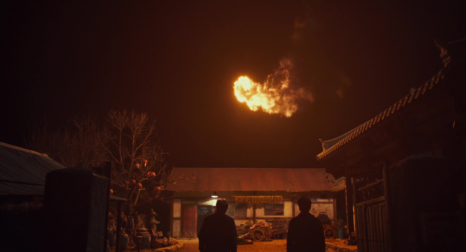
Exhuma (Jang Jae-hyun 2024)
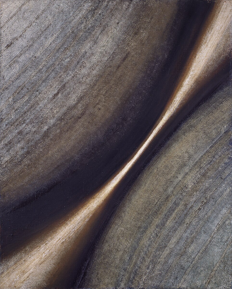
Stefan Gierowski, Obraz CXCIII
Jason Santa Maria touches on something I have been mildly irritated by and all “Actually…” about on several occasions–the use of em dashes being associated with (bad) AI-generated text. I stand with Jason in not giving this one to the machines. Em dashes are a perfectly valid character to (thoughtfully) use in your writing. My hunch is that a lot of people online suddenly started noticing them in AI-generated text because a lot of people don’t use them. After all, it’s just easier to press the hyphen instead of option + shift + hyphen.
But don’t fret, help is within reach, literally. Go and look at “Quotes & Accents (& Dashes)” courtesy of Jessica Hische and bookmark it for reference if you wish, and flavour your writing with some character! There’s also “Smart Quotes for Smart People” by Jason himself; bookmark that one as well.
~
Jason also recently released a new typeface called Citywide.
Citywide is a sans serif family inspired by mid-1900s bus and train destination roll signs. The letterforms draw from a bus roll sign I found at a flea market years ago. I’ve probably lost myself staring at that sign everyday since, thinking about how the type system works while trying to puzzle out some of the unusual choices. Why are letters like P and R so high-waisted in their wide forms, but pretty normal when narrow? Were these boxy curves drawn by hand or mechanically produced? Why does the middle stroke of the G change so much across widths?
Citywide is an interpretation of these letterforms, drawing inspiration from both my sign and others like it.
~
I linked to Atkinson Hyperlegible recently, and here’s another typeface designed with accessibility in mind – Inclusive Sans from Olivia King.
via Pixel Envy
~
I have been slow to link to this but it is absolutely worth the time it takes to go through – let Marcin Wichary take you on an adventure in typography, chasing a mysterious typeface that appears to hide everywhere in New York in “The hardest working font in Manhattan”.
~
Its Nice That talks to the founder of Kyiv Type Foundry who have been (re)creating typefaces from various station signage of the Kyiv subway. Check it out for some niche type from the subway that, until recently, held the title of the deepest station.
In the Heat of the Night (Norman Jewison, 1967)
Collected bits and pieces I’ve noticed this month.
It’s been a hot minute since I’ve compiled one of these, here goes.
First things first – pour one out for Skype, we’ll miss you.
~
Some interesting points here about design tokens, and how the wcag/figma/salesforce/design community thinks of them – "Avoiding tokens"
~
Sir Ive has been in the news lately, here’s a different kind of interview with him on BBC-s “Desert Island Disks” podcast. Some nuggets that stuck out to me:
~
Linear always publishes thoughtful pieces on their blog, this time about the relationship between AI and UI:
One way I visualize this relationship between the form of traditional UI and the function of AI is through the metaphor of a ‘workbench’. Just as a carpenter's workbench is familiar and purpose-built, providing an organized environment for tools and materials, a well-designed interface can create productive context for AI interactions.
…
AI doesn’t replace the workbench, it's a powerful new tool to place on top of it.
“Design for the AI age” by Karri Saarinen
~
Also on the topic of UI-s, Sebastiaan de With from Lux (makers of the excellent Halide camera app) imagines what direction the rumoured redesign of Apple's OS interfaces might go.
~
Glad to see that Jason Santa Maria is back writing on his blog – welcome back! Instantly added to the blogroll.
~
A list of individual dogs on Wikipedia.
via Frank Chimero on Bluesky
~
A typeface I’ve been keeping an eye on to possibly use on a project – Atkinson Hyperlegible – has recently been updated.
~
For browsing visuals that don’t try to sell you something, here’s public.work from Cosmos
via Sidebar
~
I’m not maybe a fan of the roof construction itself, but I do like the idea – a set of buildings under one roof.
La Chimera (Alice Rohrwacher, 2023)
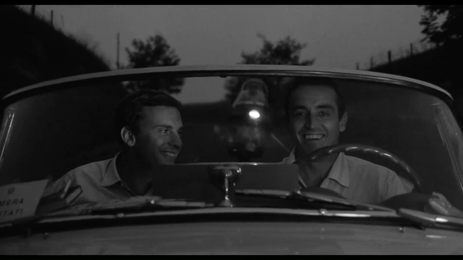
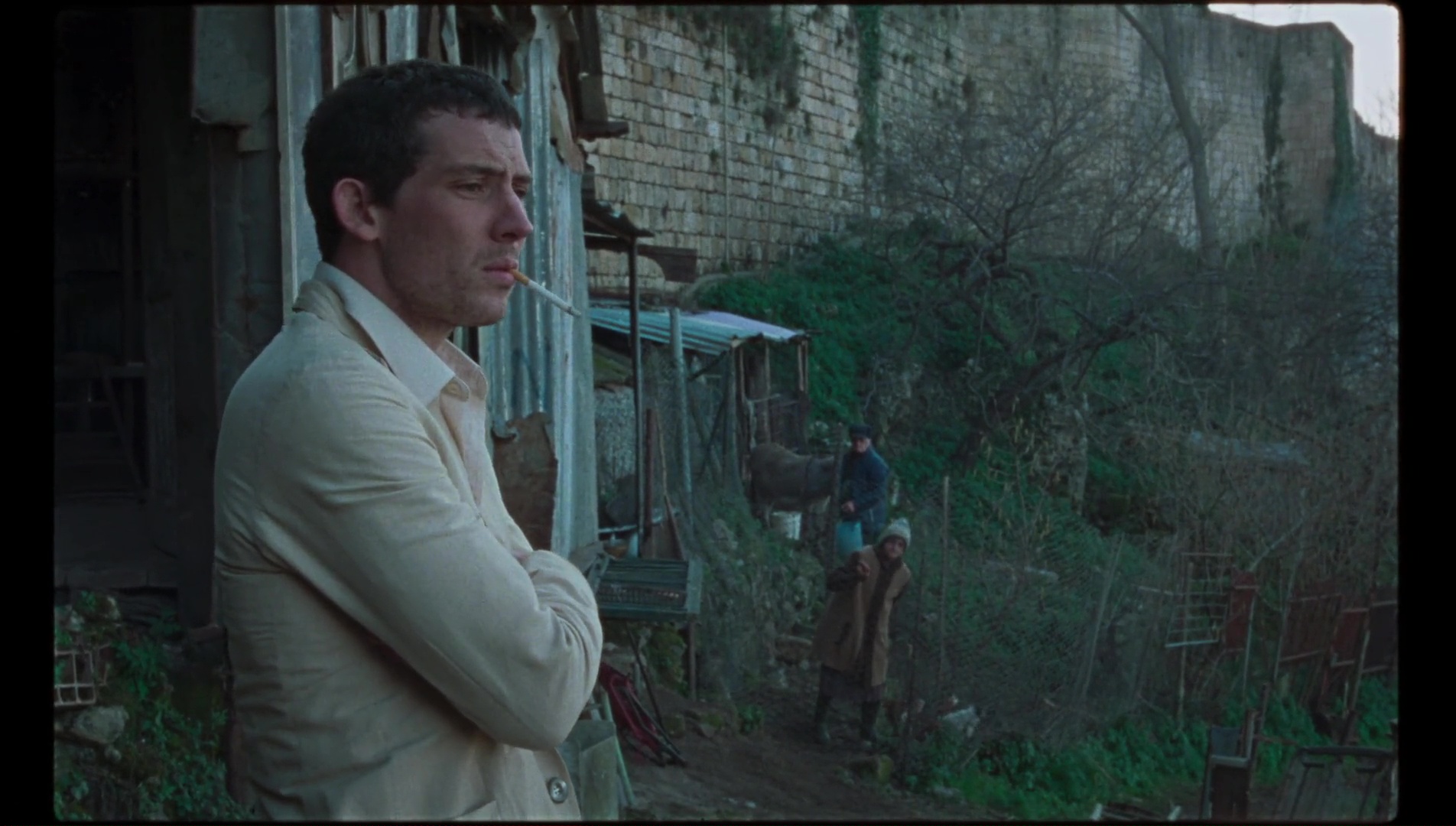
Il Sorpasso (Dino Risi, 1962)
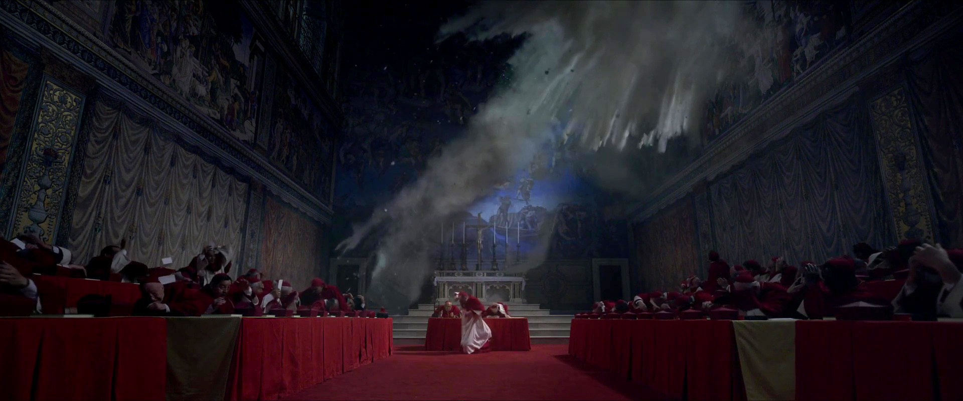
Conclave (Edward Berger, 2024)
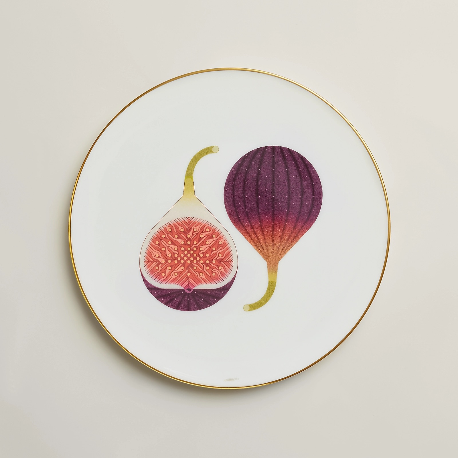
Ryo Takemasa illustrated tableware for the Karoumi collection by Hermes. Lovely.
via Spoon&Tamago
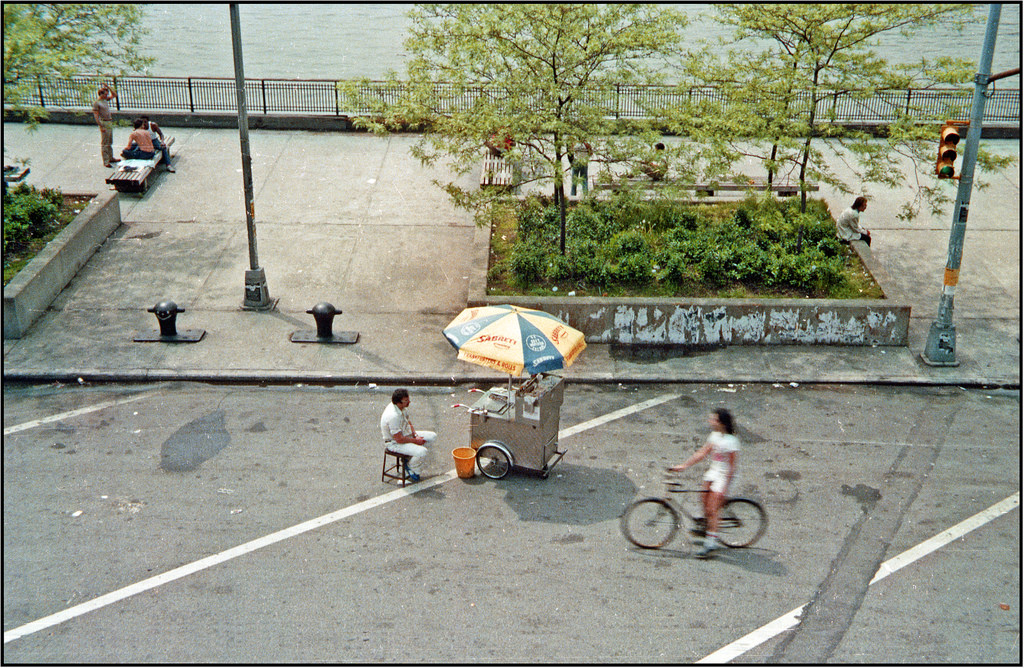
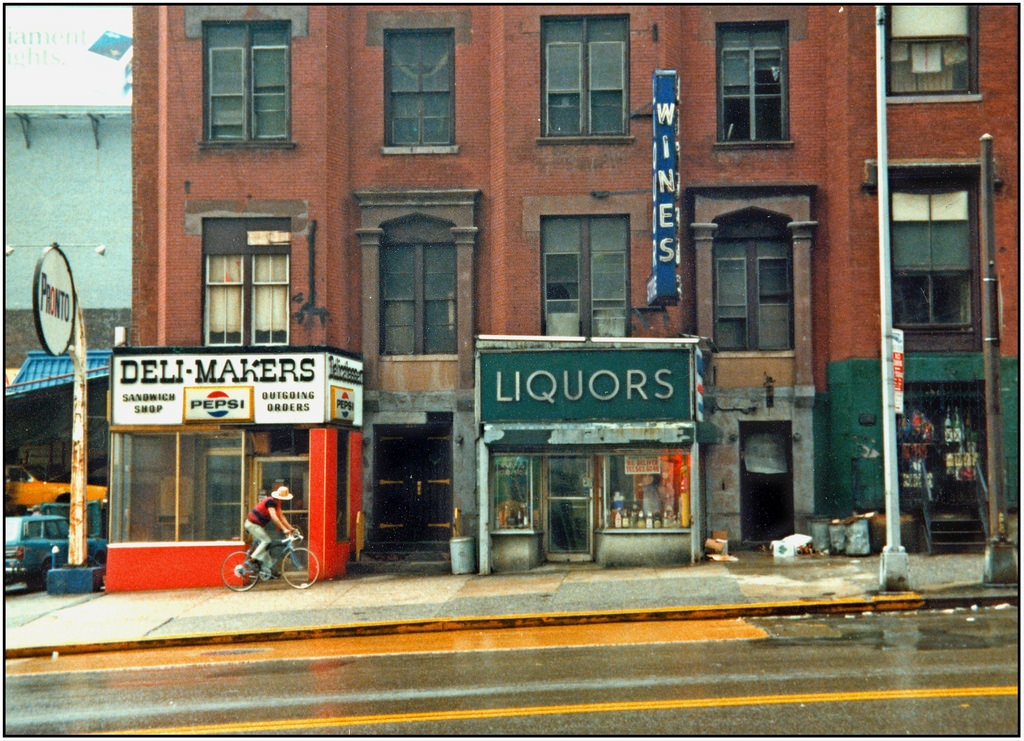
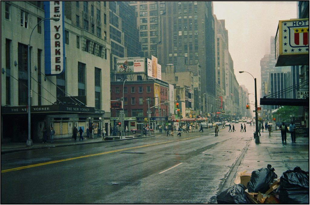
A fat stack of snapshots of New York City in 1979 by flickr user Petershagen.
Klute (Alan J. Pakula, 1971)
Collected bits and pieces I’ve noticed this month.
I enjoyed reading Jeffrey Zeldman ruminate on two beautiful things that grew from the seminal A List Apart web publication – An Event Apart and A Book Apart, both now, sadly, shuttered.
I learned a tremendous amount about web design and development, as well as adjacent topics from A List Apart. Not only was it wonderfully designed, it published a wide range of topics and shaped how I approach design for the web and also design in general. I’m very grateful for that. I was never able to attend An Event Apart, unfortunately, but I was able to acquire books put out by A Book Apart and have a number of them on my bookshelf.
But! All is not lost! Au contraire, A Book Apart gave the publishing rights back to the authors and the books have been slowly republished in various formats and one of those is Pricing Design, by Dan Mall, resurrected as a beautifully designed website.
~
With my to-do list(s) approaching bankruptcy territory, this has been following me around for some days now – “What would it mean to be done for the day?”.
via Austin Kleon
~
Some mandatory “here’s a number of things” lists – “77 Facts that Blew Our Minds” from The Atlantic, “52 Things I Learned in 2024” from Kent Hendricks, “52 Things I Learned in 2024” from Tom Whitwell.
via kottke.org
~
One thing I learned was what the “Send in the Clowns” means. From Wikipedia:
“but it's not supposed to be a circus [...] [I]t's a theatre reference meaning “if the show isn't going well, let's send in the clowns"; in other words, "let's do the jokes.””
~
(Re)watching Flaked, this house in Venice, CA, home of photographer Philip Dixon, caught my eye. I love it.

PAP.Coffee, a coffee shop in Harajuku, Tokyo owned by a specialty paper and printing company, designed to showcase paper throughout the interior. Lovely.
via Spoon & Tamago
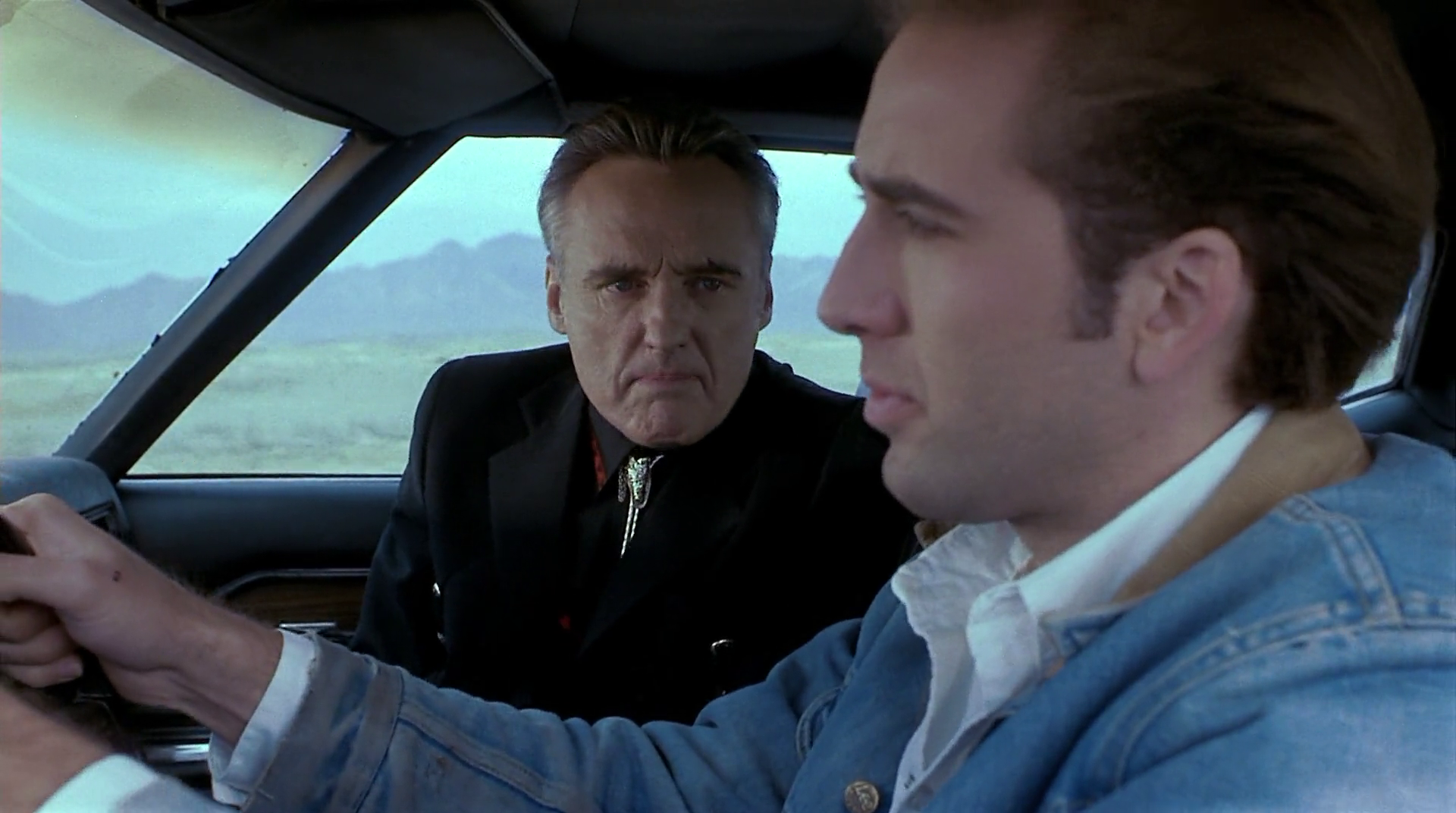
Red Rock West (John Dahl, 1993)
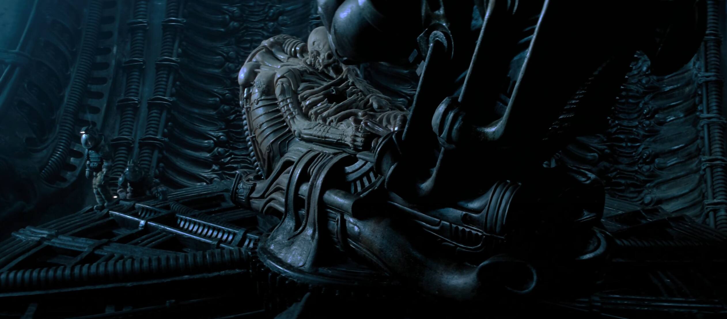
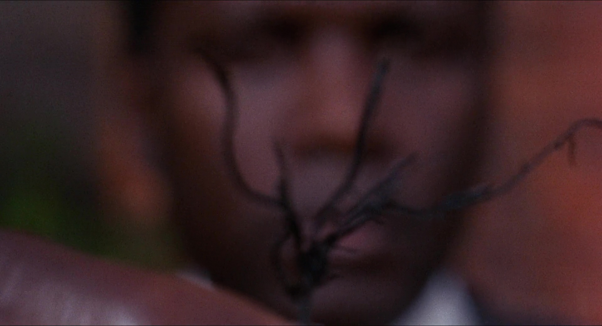
The history of the space jockey from the first Alien movie.