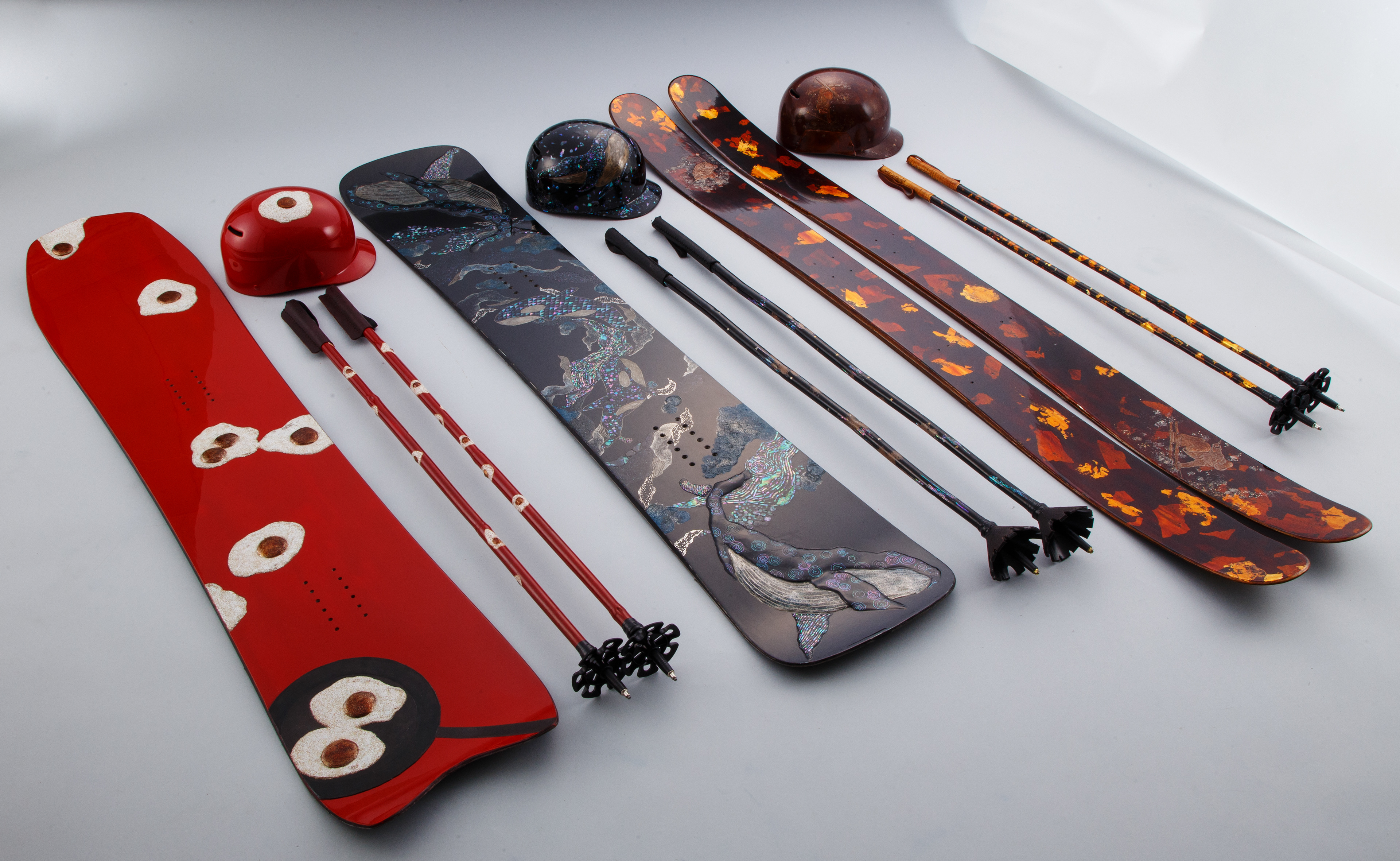
Snowboards and skis created using traditional Japanese urushi laquer by artist Sumire Morino.
via Spoon & Tamago
A running collection of things I’ve found interesting, well-made, or worth spreading—mostly from art, design, tech, photography, and film, with the occasional thought or two of my own.
Snowboards and skis created using traditional Japanese urushi laquer by artist Sumire Morino.
via Spoon & Tamago
Collected bits and pieces I’ve noticed this month.
I am gladly joining the chorus singing praise to Marcin Wichary’s Unsung blog. It’s unreasonably good.
~
“But the vast majority of the time, the single biggest problem you have is that nobody knows you exist, and nobody gives a damn about what you do.”
Anil Dash in Launch it 3 times
~
A video with every sample from Paul’s Boutique by the Beastie Boys.
via Kottke
~
I recently re-read and re-enjoyed these two interviews, one with Frank Chimero in The Great Discontent and the other with Wilson Miner on Staff Design. Both publications are no longer active, so fingers crossed these stay online, still.
~
“The lost interview” with Steve Jobs.
~
Om Malik sadly passed away. In addition to his writing, I’ve immensely enjoyed his photography.
~
“As an adult, those books had turned into a phone, and reading turned into a thing I’d get to after I checked my “socials,” which never seemed to happen. And when I was reading, I was mostly reading a lot of industry books because I wanted to be good at my job. But that turned reading into a chore, which it had never been before.
Never turn your escape pod into a utility closet.”
Mike Monteiro, “How to read”
Collected bits and pieces I’ve noticed this month.
Itnicethat interviews Hugh Miller who recently joined Pentagram as partner:
“Subtlety matters to me because it’s about leaving space for the audience to discover elements for themselves. I really believe that a piece of design should reward the second look, the slow encounter. Wit and beauty are the hooks, but subtlety is what keeps people engaged.”
~
Matt Ström-Awn on the possibly looming talent crisis in (digital product) design:
"Some argue AI will eliminate entry-level design work, making investment in junior talent pointless. This assumes design is just about creating screens and assets."
~
The search engine Kagi will not bill you if you don't use it. This is nice.
~
In Japan your garbage is your problem. Deal with it.
~
Frank Chimero offers up a way to shift how you think about and what you do with time.
~
Iconic (since demolished) Philly Love Park skate spot was faithfully recreated in Malmö, Sweden. The city has a skate coordinator, because why not.
Collected bits and pieces I’ve noticed this month.
It’s been a hot minute since I’ve compiled one of these, here goes.
First things first – pour one out for Skype, we’ll miss you.
~
Some interesting points here about design tokens, and how the wcag/figma/salesforce/design community thinks of them – "Avoiding tokens"
~
Sir Ive has been in the news lately, here’s a different kind of interview with him on BBC-s “Desert Island Disks” podcast. Some nuggets that stuck out to me:
~
Linear always publishes thoughtful pieces on their blog, this time about the relationship between AI and UI:
One way I visualize this relationship between the form of traditional UI and the function of AI is through the metaphor of a ‘workbench’. Just as a carpenter's workbench is familiar and purpose-built, providing an organized environment for tools and materials, a well-designed interface can create productive context for AI interactions.
…
AI doesn’t replace the workbench, it's a powerful new tool to place on top of it.
“Design for the AI age” by Karri Saarinen
~
Also on the topic of UI-s, Sebastiaan de With from Lux (makers of the excellent Halide camera app) imagines what direction the rumoured redesign of Apple's OS interfaces might go.
~
Glad to see that Jason Santa Maria is back writing on his blog – welcome back! Instantly added to the blogroll.
~
A list of individual dogs on Wikipedia.
via Frank Chimero on Bluesky
~
A typeface I’ve been keeping an eye on to possibly use on a project – Atkinson Hyperlegible – has recently been updated.
~
For browsing visuals that don’t try to sell you something, here’s public.work from Cosmos
via Sidebar
~
I’m not maybe a fan of the roof construction itself, but I do like the idea – a set of buildings under one roof.
Collected bits and pieces I’ve noticed this month.
I enjoyed reading Jeffrey Zeldman ruminate on two beautiful things that grew from the seminal A List Apart web publication – An Event Apart and A Book Apart, both now, sadly, shuttered.
I learned a tremendous amount about web design and development, as well as adjacent topics from A List Apart. Not only was it wonderfully designed, it published a wide range of topics and shaped how I approach design for the web and also design in general. I’m very grateful for that. I was never able to attend An Event Apart, unfortunately, but I was able to acquire books put out by A Book Apart and have a number of them on my bookshelf.
But! All is not lost! Au contraire, A Book Apart gave the publishing rights back to the authors and the books have been slowly republished in various formats and one of those is Pricing Design, by Dan Mall, resurrected as a beautifully designed website.
~
With my to-do list(s) approaching bankruptcy territory, this has been following me around for some days now – “What would it mean to be done for the day?”.
via Austin Kleon
~
Some mandatory “here’s a number of things” lists – “77 Facts that Blew Our Minds” from The Atlantic, “52 Things I Learned in 2024” from Kent Hendricks, “52 Things I Learned in 2024” from Tom Whitwell.
via kottke.org
~
One thing I learned was what the “Send in the Clowns” means. From Wikipedia:
“but it's not supposed to be a circus [...] [I]t's a theatre reference meaning “if the show isn't going well, let's send in the clowns"; in other words, "let's do the jokes.””
~
(Re)watching Flaked, this house in Venice, CA, home of photographer Philip Dixon, caught my eye. I love it.
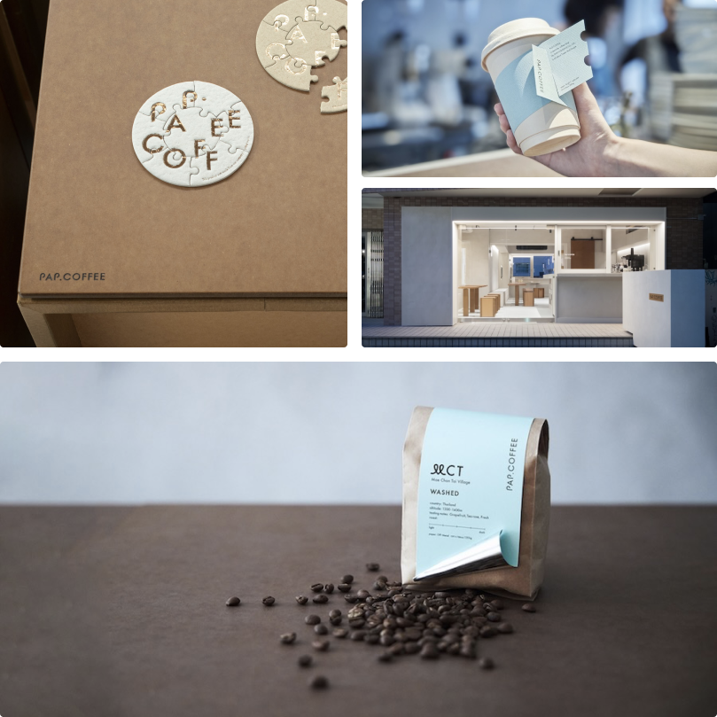
PAP.Coffee, a coffee shop in Harajuku, Tokyo owned by a specialty paper and printing company, designed to showcase paper throughout the interior. Lovely.
via Spoon & Tamago
Collected bits and pieces I’ve noticed this month.
Some podcasts I’ve found interesting lately – firstly, AirBnB CEO Brian Chesky on the Decoder podcast talking about how he runs the company and what founder mode is; and photographer Tyler Stalman on The Talk Show, discussing iPhone photography with some cool tips and thoughts around the colour science and photography, from old film stocks to todays digital camera systems. Check also Tyler’s iPhone 16 camera review (Youtube) and also these by from Austin Mann, and Vjeran Pavic (Youtube).
~
From Petapixel – the reason why old sports photos often have a rather pleasing blue background haze.
~
A two-part series from Linear on how they approached a recent redesign of their app. It’s always interesting to read and think along with how Liner work.
~
iA describe, in length, how they designed and redesigned their app icons.
~
Mozilla had their brand redesigned.
~
Using Letterboxd? This little tool let’s you find your Letterboxd besties based on what your favourite films are.
via Kottke
~
Friend is a new AI gadget, positioned as a, well, friend, who’s always there with positive vibes. I kind of like this application of AI and don’t think a made up friend is a bad thing per se.
via ATP
~
In sad news, Sidebar is indefinitely paused.
With “content moving to medium and substack” are we designers enshittificating (enshitdefecating?) our online world too?
~
Om Malik on “content”:
“You can tell a lot about a person and how they think about their work based on whether or not they use “content” to describe what they do.”
I 1000% agree.
Also check out this piece by Nick Heer on AI “content” and iA’s well-reasoned approach to writing with AI, or “Why should someone bother to read what you didn’t bother to write?”
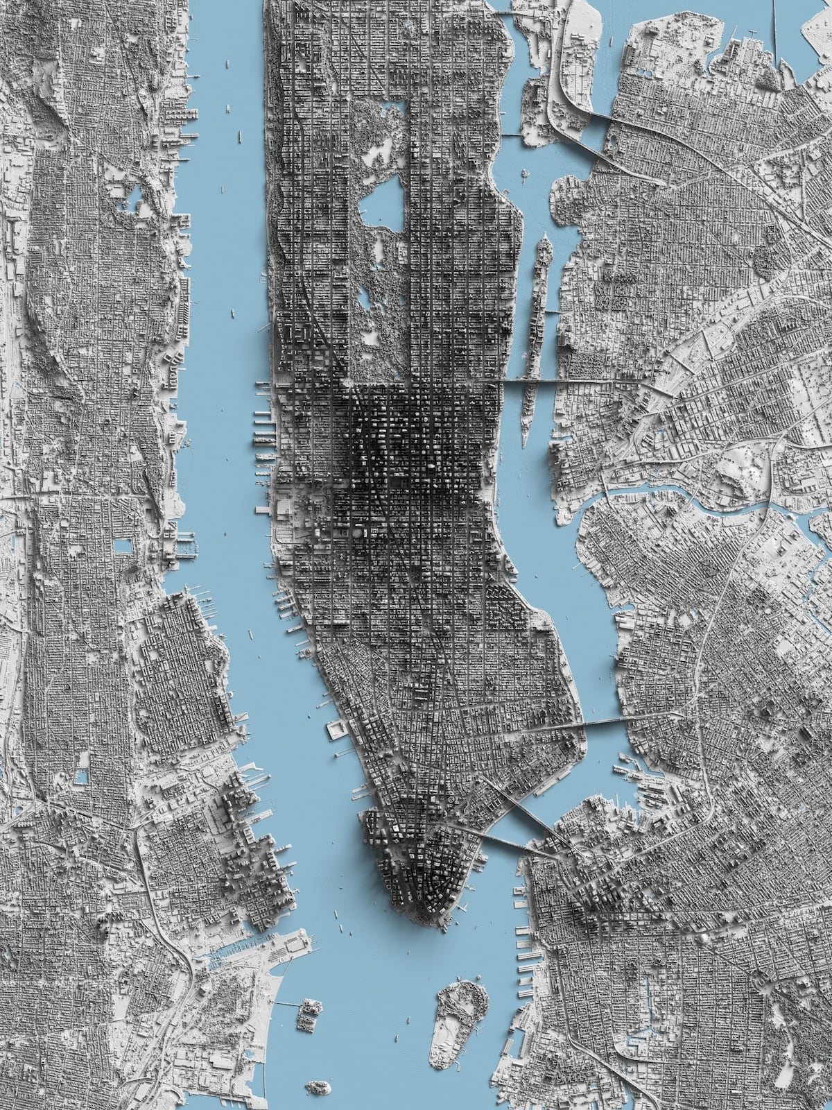
From Reddit user r/Kittyhawk, a shaded relief map of Manhattan, made from LiDAR data. Hop to Reddit to view the full-resolution image.
Collected bits and pieces I’ve noticed this month.
The Bento method of productivity – pick 3 things, large, medium and small, to work on today, and complete them one by one in whatever order. Done, done, done.
~
User Hostile Experience is a bit ranty, perhaps, but who doesn’t feel ranty when slapped in the face with a “subscribe to my newsletter” the first time you meet someone.
~
Every day for the past 21 years, photographer Noah Kalina has taken a selfie. He’s compiled them all into a video titled “7777 days” that condenses half of his life into 2 minutes.
via Kottke
~
I loved this description how poet Ruth Stone “catches” poems. I remember Rick Rubin talking about a similar thing in his book The Creative Act – how art, be it poetry or music or painting or a photograph, exists in the world and the artist merely captures it.
“As [Stone] was growing up in rural Virginia, she would be out, working in the fields and she would feel and hear a poem coming at her from over the landscape. It was like a thunderous train of air and it would come barrelling down at her over the landscape. And when she felt it coming . . . ‘cause it would shake the earth under her feet, she knew she had only one thing to do at that point. That was to, in her words, “run like hell” to the house as she would be chased by this poem.
The whole deal was that she had to get to a piece of paper fast enough so that when it thundered through her, she could collect it and grab it on the page. Other times she wouldn’t be fast enough, so she would be running and running, and she wouldn’t get to the house, and the poem would barrel through her and she would miss it, and it would “continue on across the landscape looking for another poet.”
via Design Matters
~
Actually the line that I think was the most telling but that she said like a throw-away qualifier was “I didn’t know anyone in New York when I moved here…”
I think that is such a huge factor. To move to a city where you are not afraid to try something new because all the people that labeled who THEY think you are (parents, childhood friends) are not their to say “that’s not you” or “you’ve changed”. Well, maybe that person didn’t change but finally became who they really are.
Collected bits and pieces I’ve noticed this month.
Jasmin Paris became the first woman ever to complete the Barkley Marathons.
~
VWFNDR Keirin. I find this concept camera interesting on a few levels. On one, it’s part of what seems to be a resurgence of niche but fun-looking devices with cool design and an attitude like the Playdate game console with its single colour screen and fun crank arm, or the Rabbit R1 (not the best-reviewed, putting it mildly) – intentionally limit the funcionality and tech and force yourself to come up with novel ideas to get around these giving the device tons of personality in the process. Design loves constraints. On the other, it leverages the relative freedom a large touchscreen gives to play with new interface design ideas. I was immediately reminded of the soviet Horizon panoramic camera that utilised a unique swiveling lens to take awesome panoramic photos on regular 35mm film stock. I’m rooting for Keirin to graduate from a concept to a product.
~
I enjoyed this interview with Stefan Sagmeister on the Design Matters podcast.
~
Eye on Design has published an oral history of how the Processing programming language came to be and evolved. I made this 2001: A Space Odyssey poster with Processing.
~
Makes sense, the Helsinki Bus Station Theory of Creativity.
See also: the polish paradox.
~
“Let’s make the indie web easier” by Giles Turnbull on making it easier for people to make and run their own sites rather than installing WordPress or simply giving up. I was so put off by the “it’s easy, just (insert tech acronym salad here)” when I tried to see if some modern web tech would make building and publishing a site like mine easier.
~
And, found via Gilest, here’s Good Enough. I always like when a small team is making fun stuff.
~
I learned a few things from “12 Figma tips to work more efficiently”, maybe you will too.
via sidebar.io
Collected bits and pieces I’ve noticed this month.
In “Rethinking the startup MVP: Building a competitive product” Linear co-founder Tuomas Artman argues how it’s more and more unlikely your MVP has to prove an idea, but rather that it has to execute an idea better than the others have.
~
Legendary car designer Marcello Gandini has passed. He was the designer behind for the iconic Lamborghini Countach, an even more shard-like Lancia Stratos Zero concept car and played a part in shaping one of the most beautiful automobiles, the Lamborghini Miura.
via Wallpaper
~
“The job is not to invent, but to curate” says Josh Clark from Big Medium in “The Most Exciting Design Systems Are Boring”. Design systems should take the boring, the mundane off your (and your colleagues) hands so you can solve some new problems instead.
~
In more sad news, Tiny Letter was shut down. I miss Pome.
~
And in even more sad news, A Book Apart also closes.
~
Chris Coyer shares his thoughts on what’s going on with CSS Tricks post selling it to Digital Ocean. I learned so much from CSS Tricks and the tone of the site was so friendly and approachable, what a bummer.
~
And wrapping it up with CSS, Richard Rutter rebuilds a Creative Boom article page with no media queries, just fluid type. Cool.
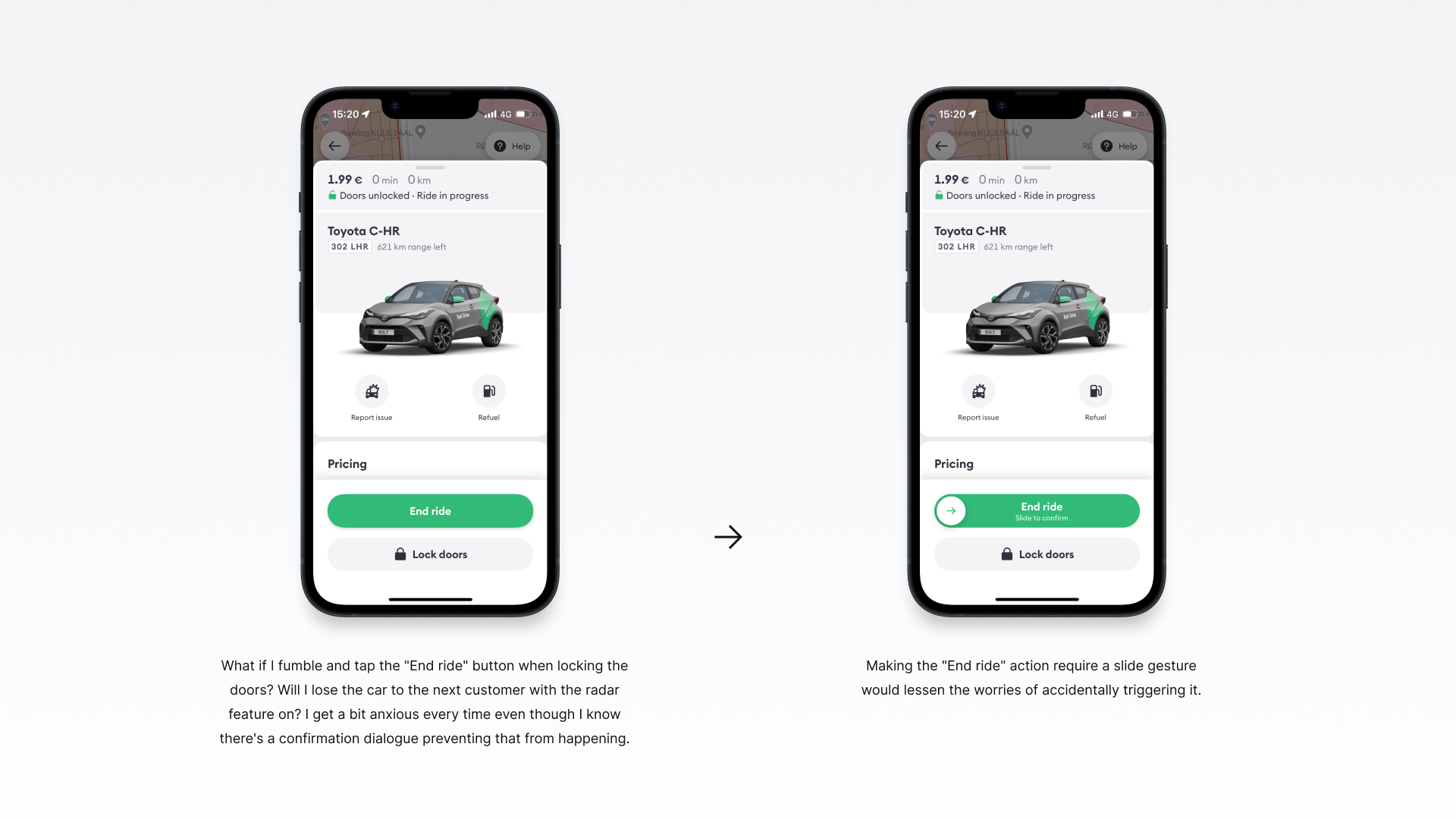
What if I fumble and tap the "End ride" button when locking the doors? Will I lose the car to the next customer with the radar feature on? I get a bit anxious every time even though I know there's a confirmation dialogue preventing that from happening.
Making the "End ride" action require a slide gesture would lessen the worries of accidentally triggering it.
That being said, this is a concept design and I'm sure designers at Bolt have considered this and have their reasons for not using this interaction pattern here. Because a slide gesture is required to unlock the doors when starting a ride and this would run the risk of muddying things too much – slide to unlock or tap to cancel at the start, tap to unlock or slide to end during a ride.
Collected bits and pieces I’ve noticed this month.
In “Improving The Double Diamond Design Process” Andy Budd writes about how the “Double Diamond” design process is an ideal that does not match how design actually happens in many (most?) organisations and how it could be improved to be more usable and useful in reality.
~
Interaction design is two things.
- managing attention
- persuasion
Once you come to the realization/acceptance that no one – not even the interested, motivated, and committed – has the kind of focused attention available for your thing that you assume they have, you will have a much better chance of capturing and sustaining any of it at all.
~
In “Why note-taking apps don’t make us smarter”, which is well worth a read if you care about thinking and note-taking and note-taking for better thinking, Casey Newton links to researcher Andy Matuschak’s site on note taking. Wow. I got lost in there, in a good way, for quite some time and still keep it open in a tab.
~
On a related note, ahem, I love how Readwise is approaching highlights and sidenotes in their Readwise Reader reading app.
~
Good career advice from Julia Evans: Get your work recognized: write a brag document
via kottke.org
~
On good line length based on research: “Line length revisited: following the research” by Mary Dyson
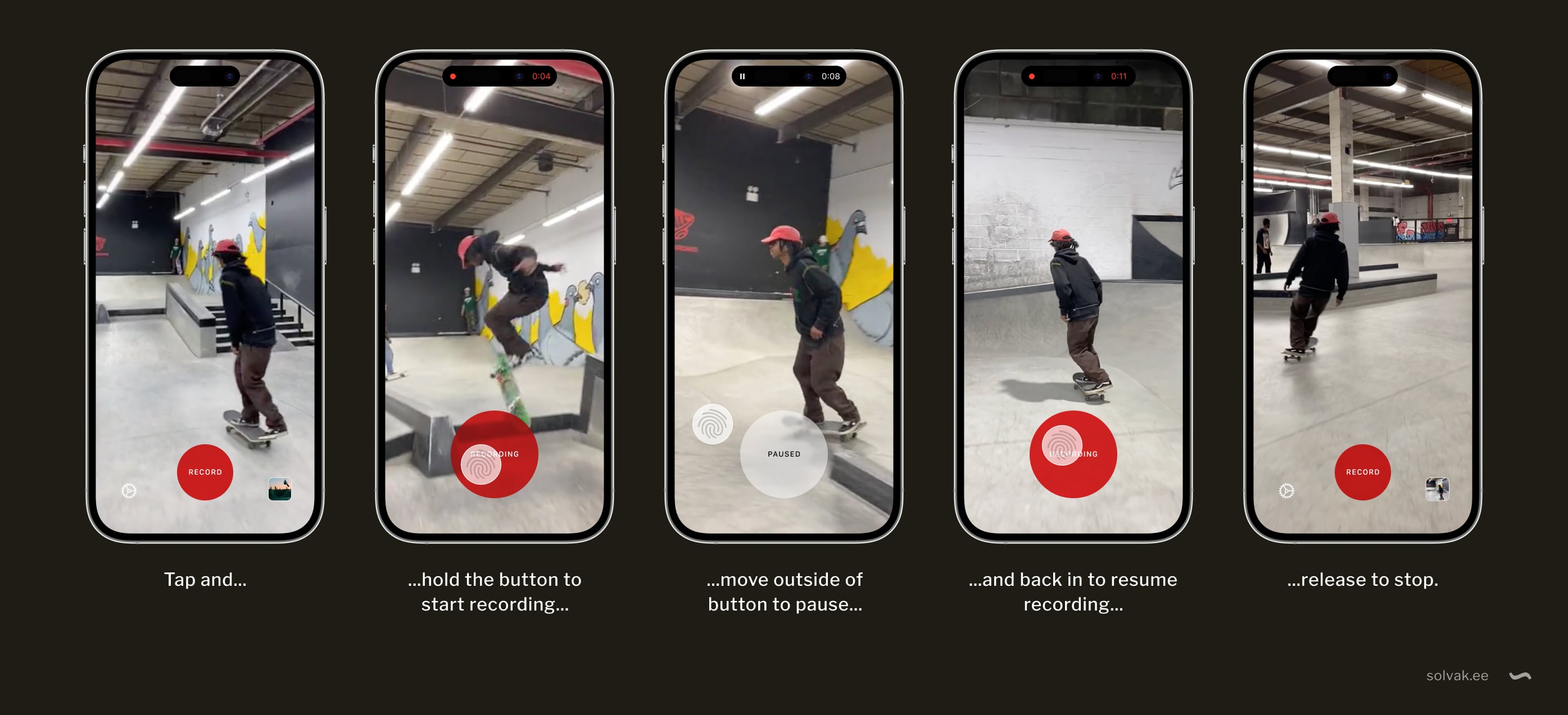
This is a mockup of an idea I had. It is for a UI interaction for recording video on your phone while editing it in a way.
To start recording, you tap and hold the “Record” button.
Move your finger off the button to pause and back on to resume recording. To stop, lift your finger, and the video is saved to the camera roll.
The button is circular for a good balance between surface area and the distance required in every direction to move your finger off it. It also grows larger when tapped, so you don’t accidentally pause when you move your finger a little.
Whether a kind of fluid blob of a button that “sticks” to your finger a little before letting go and pausing would be a neat way to indicate the threshold between recording and pause or be a flaw instead could be discovered with an actual prototype. But I have a hunch there might be a sweet middle ground somewhere.
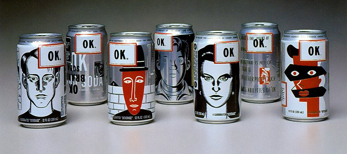
Today I learned that in 1993 Coca-Cola created OK Soda in an effort to lure Generation X. A bold swing marketing and design wise, but a flop product wise. More on Messy Nessy Chic and Two Designers Walk Into a Bar.
via Cabel Sasser
Image courtesy Two Designers Walk Into a Bar
Collected bits and pieces I’ve noticed this month.
Ben Evans and Om Malik on the fall of the social web.
I’ve been bummed about the fall of Twitter*†, but I’m beginning to think I should not be.
*And Tumblr before that, though it has somewhat recovered and found a good parent in Automattic.
† And the deterioration of reddit after it.
~
Austin Kleon in Defined by Negatives:
I’ve long been inspired by the punk band Wire’s rules of negative self-definition: “No solos; no decoration; when the words run out, it stops; we don’t chorus out; no rocking out; keep it to the point; no Americanisms.”
I think it’s often best to start by deciding what you won’t do and set up boundaries and constraints and guardrails.
~
Stephanie Smith writes on the Wise Design Medium… um… blog, about making better colour choices that are accessible and also on brand: “Accessible but never boring (Part 1)”
~
“I make things because I enjoy making them. I share them when I have a sense that those things are exactly the sort that would inspire me had I not made them myself. This is not the way to build a large audience, to achieve fame, or to amass wealth. But it is the way to be seen (a very different thing from being validated) that also creates a way for someone else.
The best thing that could happen when I share something online is for someone else to experience it and think, “If he can do that, then I can __.””
The View from Here - Christopher Butler
~
River, a visual connection engine. "Clear your mind and surf laterally through image space."
Via Kottke
This piece by Jose M. Gilgado got linked to on several blogs and it got me thinking.
Gilgado:
When we buy a physical product, we accept that it won’t change in its lifetime. We’ll use it until it wears off, and we replace it. We can rely on that product not evolving; the gas pedal in my car will always be in the same place.
I’d argue that the great thing about software is precisely that it’s never finished, that it can be changed for the better without throwing it out and buying a new one.
But I see where this is coming from – software changing for the worse, from being tired of constant feature creep and ever more bloated software we often have no choice but to use.
To borrow Gilgado’s analogy: stop moving the gas pedal around.
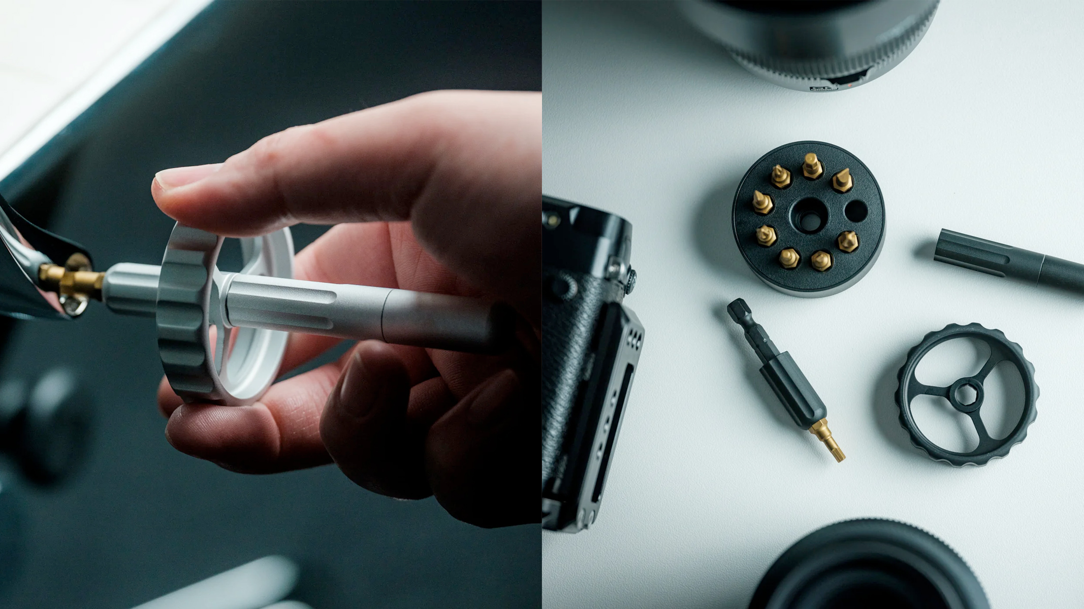
I can't wouch whether it is a better screwdriver or not, but this thing looks cool, like it belongs in a sci-fi movie.
via Kottke
Collected bits and pieces I’ve noticed this month.
In March 2012 a new drawing app called Paper, made by FiftyThree, was launched for the iPad. Ten years later one of its founders Andy Allen reflects on the decisions behind the app's many unique features.
~
These new Gold foil Field Notes are oh-oh-oh so pretty!
via Coudal
~
Cooper Hewitt published the 2023 National Design Awards winners.
via kottke.org
~
Ikea’s research and design lab Space10 is no more.
via it’s nice that
~
Having wrestled with making a complex app layout play nice on differently sized screens, keeping the essentials available on smaller screens and carefully considering what to add when there is screen space available, a lot of the problems and layout visualisations in this case study of rebuilding the layout of TechCrunch with modern CSS looked very familiar. Long, but good.
via Sidebar
~
Cabel Sasser observes how people use the world (or in this case, amusement parks) differently from how the designers intended:
“If it looks neat, people will want to take a photo with it. If it looks comfortable, people will want to sit on it. If it looks fun, people will play around on it.”
via Daring Fireball
Collected bits and pieces I’ve noticed this month.
The Mpemba effect, or why hot water freezes faster than cold water.
via Serious Eats
~
The IMAX theatres where lucky people get to see Oppenheimer and other films projected off 70mm prints, run an emulator of the Palm m130 aka the Palm Pilotas part of the projection system. Why? Because it works.
~
This has, by now, circulated wide and far in design-related interwebs. Nonetheless, nice observations and thoughts on the intangible in interaction design from Rauno Freiberg.
~
From Robin Dunbar of Dunbar's number fame, comes a chart showing the number of people one can have a meaningful relationship with at various levels of intimacy. This is obviously not an introvert's chart, ha-ha, ha…
“The layers come about primarily because the time we have for social interaction is not infinite. You have to decide how to invest that time, bearing in mind that the strength of relationships is directly correlated with how much time and effort we give them.”
via Kottke
~
Some novel music apps from developer Marcos Tanaka – MusicHarbor for finding out about new releases by artists in your Apple Music library and MusicBox, which is best described as “read-it-later, but for music”.
Collected bits and pieces I’ve noticed this month.
"If you do have streaks in your app, to avoid completely demoralizing your users after a streak loss, offer them a chance at streak redemption."
~
"Because no matter how good Figma is, it's an intermediary abstraction, like Photoshop before it. If you're working with the web, you'll work faster without such an abstraction layer in the design process filtering the collaboration between programmer and designer.
...
Leave Figma to the early conceptual stages of web design. Or put it to good use for native mobile development, when you rarely have a choice. But embrace doing the bulk of the design for the web directly in the core elements of its periodic table."
The old "should designers code?/designers should code" yadda yadda yadda.
I mostly agree, that we keep replacing Photoshop with faster, more convenient tools for us to make pictures of websites. End of the day though, they’re still pictures of websites and apps.
When you're working on an app with a mostly locked set of components and styles (a design system), working directly in code can be totally OK, and will shorten the time it takes to ship the change. Add to that the (waste of) time spent on keeping your pictures of the app synchronised with the app itself and working directly in code makes even more sense. Exploring wildly different layouts and design ideas is still faster with visual tools.
~
Masnick's Impossibility Theorem
"And thus, throwing humility to the wind, I’d like to propose Masnick’s Impossibility Theorem, as a sort of play on Arrow’s Impossibility Theorem. Content moderation at scale is impossible to do well. More specifically, it will always end up frustrating very large segments of the population and will always fail to accurately represent the “proper” level of moderation of anyone."
via Daring Fireball
~
"You, me, and UI", is a nice article series on various topics to do with user interfaces from The Verge.
~
What's in a day if you mash the activities of all 8 billion people on Earth into one?
Among other things:
Time spent growing and collecting food varied strongly with wealth, from over 1 hour in low-income countries to less than 5 minutes in high-income countries.
via Om Malik
Collected bits and pieces I’ve noticed this month.
In May 2022, the Mozilla Foundation took a look at the privacy situation of mental health apps, and what they saw was not very pretty. Checking up on it a year later, still not a very pretty sight.
via The Verge
~
"Building like it's 1984: A comprehensive guide to creating intuitive context menus" is a good, comprehensive writeup on, well, context menus. By Height.
~
John Siracusa's unsolicited spec for streaming app interfaces – a short collection of table stakes features so your app doesn't suck.
~
"Net Promoter Score Considered Harmful (and What UX Professionals Can Do About It)" I don't encounter many NPS surveys these days, luckily, and an (even remotely) correctly timed one is an even rarer occurrence.
via Zeldman on Twitter
~
Today I learned that the gibberish-looking text where a word or phrase is suddenly in a different font with a lot of symbols and whatnot all around and over it is called Zalgo text.
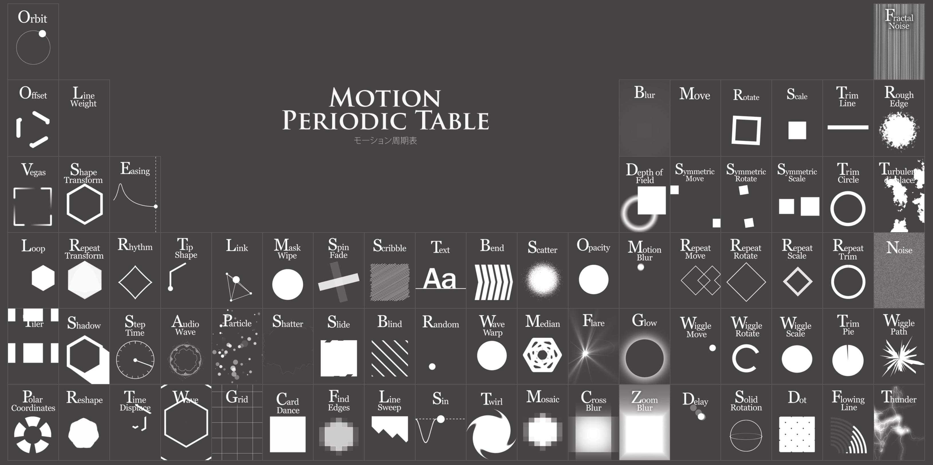
Motion Periodic Table. File under "cool shit on the internet".
Collected bits and pieces I’ve noticed this month.
Jony Ive, Marc Newson, and Peter Saville talk to Wallpaper about the creation of LoveFrom, Serif, the design studio's bespoke typeface.
via Sidebar
This Figma "switchboard" tip will save you a lot of clicks and avoid a lot of spaghetti.
AI is really good at coming up with new horrible stuff. At least as good as us humans, only way faster. And this is from way back in 2022: "AI suggested 40,000 new possible chemical weapons in just six hours"
A treasure trove of 60s garage rock on Youtube.
Craig Mod's experience in Venice very much matches my own:
As I lifted her substantial luggage, careful to do so only with my legs, not my back, she intoned in German-accented English: Thank you, this broken foot of mine vould not keep me avay, nothing vould keep me avay from my dear Venice.
Her deranged veneration seemed omnipresent and fundamental to the city. I felt surrounded by cult worshipers. But they all vanished when I ippon ura’d (“one street backed” as we call it in my Japan pop-up newsletters) the sinking town. It seemed as if very few were here to explore.