Notes

Interesting and/or cool stuff I've come across from art, design, technology, photography, movies I've watched and liked and, occasionally, my thoughts.

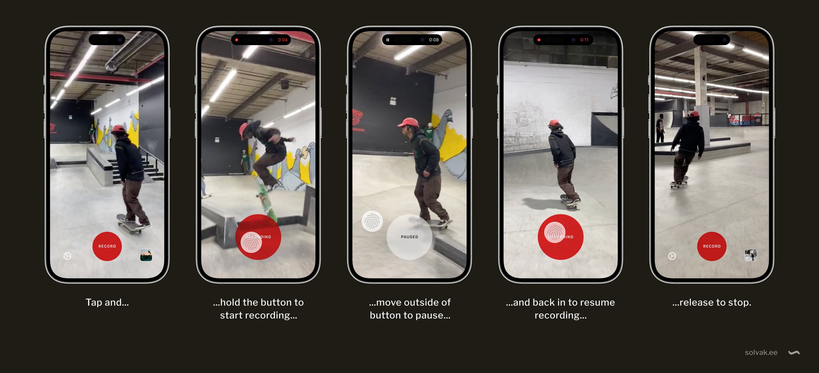
This is a mockup of an idea I had. It is for a UI interaction for recording video on your phone while editing it in a way.

To start recording, you tap and hold the “Record” button.
Move your finger off the button to pause and back on to resume recording. To stop, lift your finger, and the video is saved to the camera roll.

The button is circular for a good balance between surface area and the distance required in every direction to move your finger off it. It also grows larger when tapped, so you don’t accidentally pause when you move your finger a little.

Whether a kind of fluid blob of a button that “sticks” to your finger a little before letting go and pausing would be a neat way to indicate the threshold between recording and pause or be a flaw instead could be discovered with an actual prototype. But I have a hunch there might be a sweet middle ground somewhere.

Noted, June 2023

Collected bits and pieces I’ve noticed this month.

Lukas Mathis:

"If you do have streaks in your app, to avoid completely demoralizing your users after a streak loss, offer them a chance at streak redemption."

~

David Heinemeier Hansson:

"Because no matter how good Figma is, it's an intermediary abstraction, like Photoshop before it. If you're working with the web, you'll work faster without such an abstraction layer in the design process filtering the collaboration between programmer and designer.
...
Leave Figma to the early conceptual stages of web design. Or put it to good use for native mobile development, when you rarely have a choice. But embrace doing the bulk of the design for the web directly in the core elements of its periodic table."

The old "should designers code?/designers should code" yadda yadda yadda.
I mostly agree, that we keep replacing Photoshop with faster, more convenient tools for us to make pictures of websites. End of the day though, they’re still pictures of websites and apps.
When you're working on an app with a mostly locked set of components and styles (a design system), working directly in code can be totally OK, and will shorten the time it takes to ship the change. Add to that the (waste of) time spent on keeping your pictures of the app synchronised with the app itself and working directly in code makes even more sense. Exploring wildly different layouts and design ideas is still faster with visual tools.

~

Masnick's Impossibility Theorem

"And thus, throwing humility to the wind, I’d like to propose Masnick’s Impossibility Theorem, as a sort of play on Arrow’s Impossibility Theorem. Content moderation at scale is impossible to do well. More specifically, it will always end up frustrating very large segments of the population and will always fail to accurately represent the “proper” level of moderation of anyone."

via Daring Fireball

~

"You, me, and UI", is a nice article series on various topics to do with user interfaces from The Verge.

~

What's in a day if you mash the activities of all 8 billion people on Earth into one?
Among other things:
Time spent growing and collecting food varied strongly with wealth, from over 1 hour in low-income countries to less than 5 minutes in high-income countries.
via Om Malik

Noted, May 2023

Collected bits and pieces I’ve noticed this month.

In May 2022, the Mozilla Foundation took a look at the privacy situation of mental health apps, and what they saw was not very pretty. Checking up on it a year later, still not a very pretty sight.
via The Verge
~
"Building like it's 1984: A comprehensive guide to creating intuitive context menus" is a good, comprehensive writeup on, well, context menus. By Height.
~
John Siracusa's unsolicited spec for streaming app interfaces – a short collection of table stakes features so your app doesn't suck.
~
"Net Promoter Score Considered Harmful (and What UX Professionals Can Do About It)" I don't encounter many NPS surveys these days, luckily, and an (even remotely) correctly timed one is an even rarer occurrence.
via Zeldman on Twitter
~
Today I learned that the gibberish-looking text where a word or phrase is suddenly in a different font with a lot of symbols and whatnot all around and over it is called Zalgo text.

Noted, October 2021

Collected bits and pieces I've noticed this month.

One Day—And One Night—In the Kitchen at Les Halles

Anthony Bourdain describes one day—and one night—in the kitchen at Les Halles, his retaurant in New York City. I've read this numerous times and it's always a treat. It's also, always, a reminder to stop myself from entertaining any ideas of restaurateurship (is that a word?).

The Nash equilibrium

In game theory, the Nash equilibrium is the most common way to define the solution of a non-cooperative game involving two or more players. In a Nash equilibrium, each player is assumed to know the equilibrium strategies of the other players and no player has anything to gain by changing only their own strategy.

It is named after the mathematician John Forbes Nash Jr. who, among his other notable achievements, pretty much willed himself to function despite suffering from schizophrenia by deciding that the hallucinations caused by the illness were not worth his attention.

The Clearview AI horror show goes on

From Wired:

Some of Clearview’s new technologies may spark further debate. Ton-That says it is developing new ways for police to find a person, including “deblur” and “mask removal” tools. The first takes a blurred image and sharpens it using machine learning to envision what a clearer picture would look like; the second tries to envision the covered part of a person’s face using machine learning models that fill in missing details of an image using a best guess based on statistical patterns found in other images.

May spark further debate? You don't say! How is this horror show still allowed to operate?

via Pixel Envy

The Start menu

Lukas Mathis briefly on the Windows 10 full-screen start menu being killed in Windows 11. I always liked the full-screen menu too.

Spell'd

Marcin Wichary shares a neat little text utility from his days at Medium.

We're getting some flavour of this with tools like Grammarly (alternative wording and tone suggestions), but it's not exactly as lightweight and elegant and natural feeling. I do miss having the definitions + spelling features available for any text I select, regardless of what app I'm in. Or maybe I just don't know how to invoke it?

Also, I... dislike it when people who tweet often bulk-delete their tweets, leaving odd gaps in the thread.

...

Everybody's favourite typeface website I Love Typography now has a store.

...

Frank Chimero is a designer who writes, this time, about colour:

"Late day, late August, ocean front, looking out: wine dark sea, red ochre sky, and at the boundary? From nowhere: chartreuse."

A method for grouping files without folders.

Folders are hard. Organising information into deep hierarchies with a structure that makes sense and navigating it later takes mental energy.

The mental burden of it might be small and unnoticable, much like the simple fact of having gears on your bike reserves some of the cognitive resources of your brain to constantly think about them. You may not notice it and if someone tried to tell you it’s so, you might even disagree. But these things add up, and you really should use your brain for more important stuff.

Folders are also hard in the sense of being unconditional. You’re taking some stuff, putting it into a drawer and closing it. It’s  hiding things from view, making you remember where, in which drawer that thing you’re looking for is.

I’m not entirely against folders - big complex projects need this level of organisation. But at times I find myself wishing for a softer way of organising files. Continuing  with the drawer metaphor, I’d like a way to just group items on my desk, so they’re always visible, but still organised to some extent. What I’m wishing for is something like Fences, but not limited to the desktop. Windows 7 allows grouping by a myriad of criteria, but I can’t define my own groups.

Working on a design project I might have multiple iterations of the design as Photoshop or Illustrator files, multiple preview jpeg’s, reference files, stray ideas and wild guesses plus specs from the client and, last but not least, the finished work. I might stuff all these into respective folders and that would give me a nice clean desk, but I would  also lose the one glance overview. Out of sight often means out of mind.

Here’s how I imagine it could work.

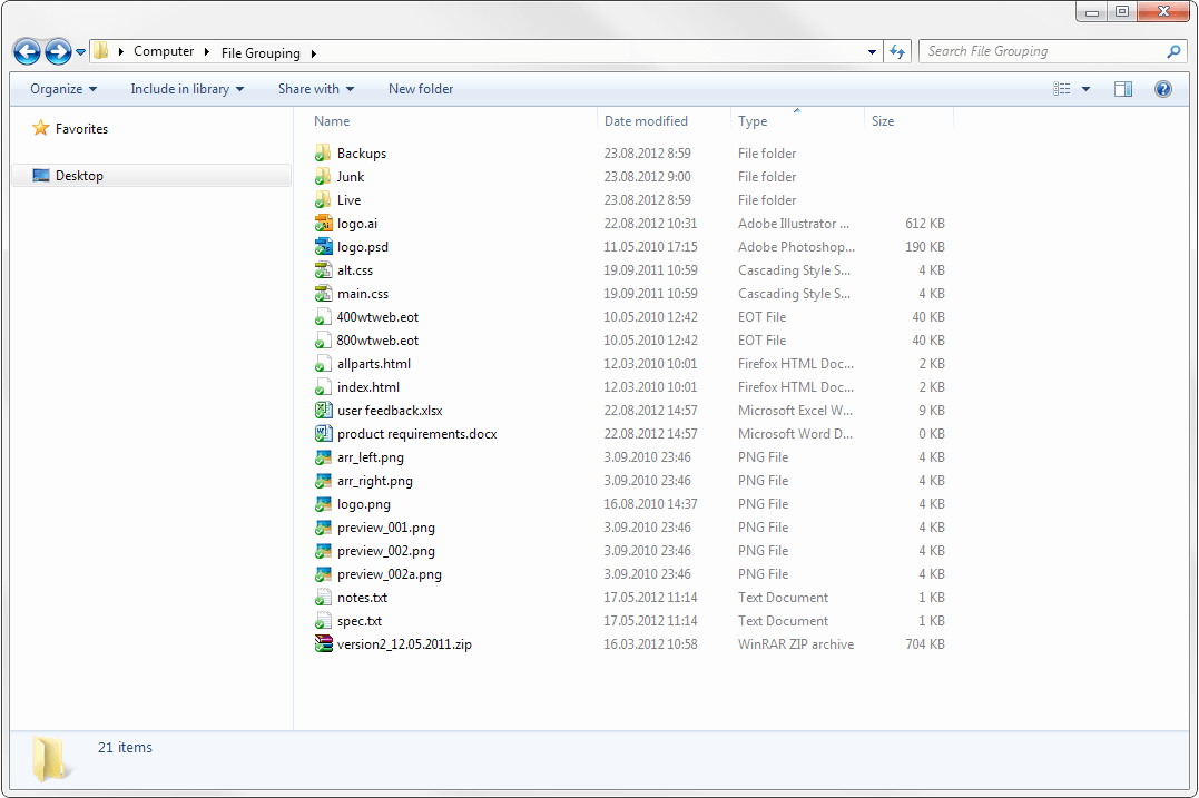
Let’s start off with the aforementioned imaginary project. It’s a folder with other folders and miscellaneous files in it.

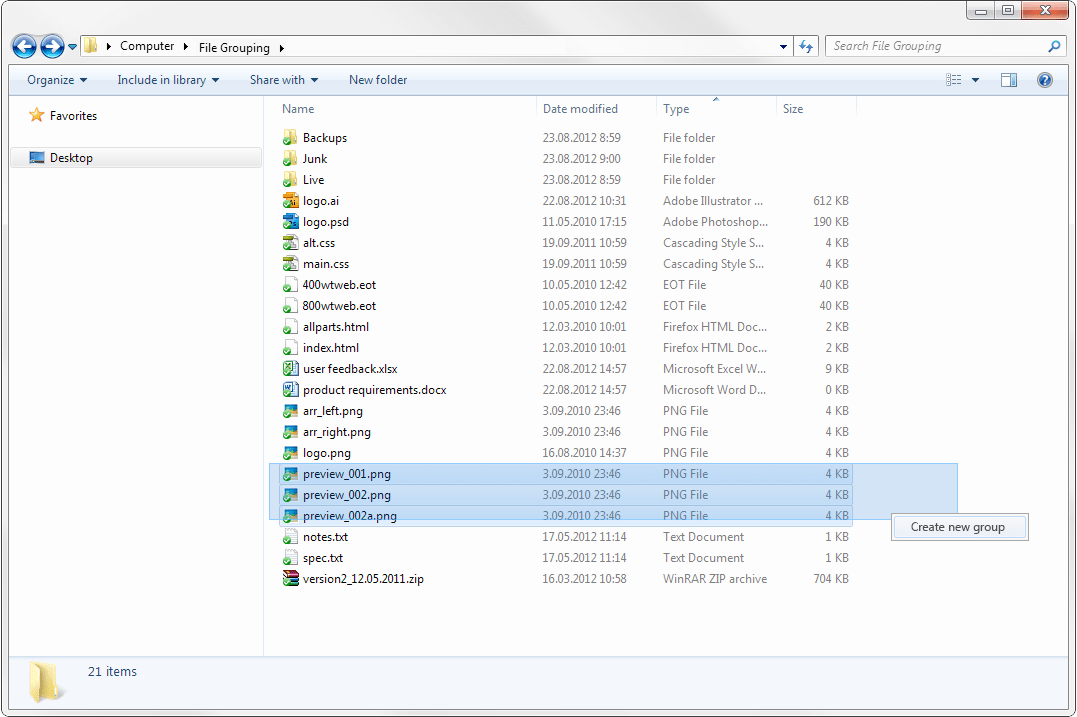
Instead of stuffing the loose files into respective folders (previews, feedback, client etc.) one would select the files to group by either drawing a box around them or ctrl clicking on the files. One could also right-click anywhere and create a new group from a context menu.

The groups would be collapsible and show how many files they hold just like the current way groups work in Windows 7. You could rename a group any time and also change it’s color, for example you could decide that groups containing preview files are always blue and groups of client files are red, making them easy to distinguish by a glance. Deleting a group would not delete the files in that group. You could also have empty groups for visual clues of the projects structure before all files get there.

And that’s it, a more lightweight way of organising files.

By the way, I recommend reading Oliver Reichensteins blog post about getting rid of deep folder hierarchies in Apple’s Mountain Lion OS.