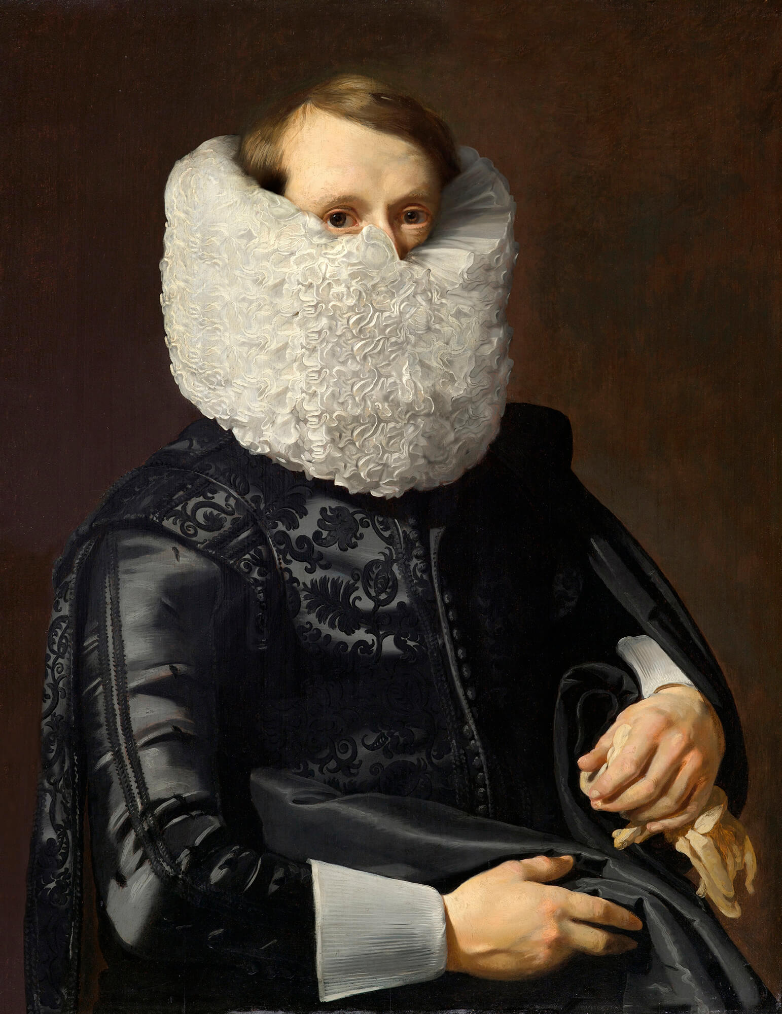
“Hidden Portraits” by Volker Hermes.
A running collection of things I’ve found interesting, well-made, or worth spreading—mostly from art, design, tech, photography, and film, with the occasional thought or two of my own.

“Hidden Portraits” by Volker Hermes.
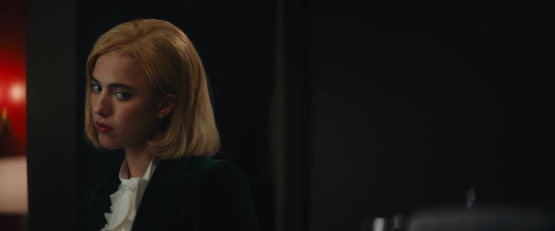
Sanctuary (Zachary Wigon, 2022)
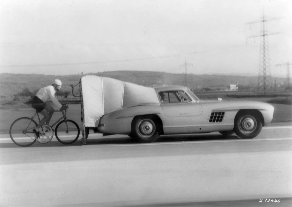
On July 19, 1962, José Meiffret set a new motor-paced cycling speed record of 204.73 km/h, on a bike with a 130-tooth chainring and wooden rims.
via reddit

From Colossal:
For a now out-of-print book titled Kowloon City: An Illustrated Guide, artist Hitomi Terasawa drew a meticulous cross-sectioned rendering of the urban phenomenon to preserve its memory. The massive panorama peers into the compact neighborhood, glimpsing narrow dance halls, laundry dangling from balconies, and entire factories tucked inside cramped quarters.
See the full resolution panorama.
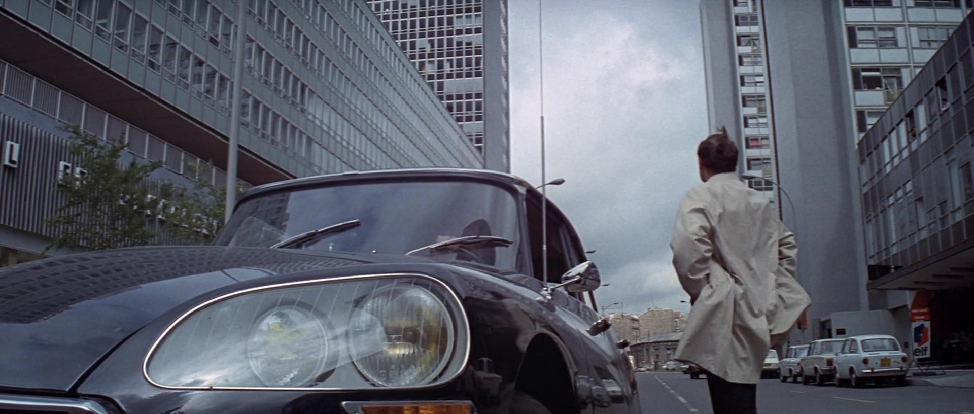
The Sicilian Clan (Henri Verneuil, 1969)
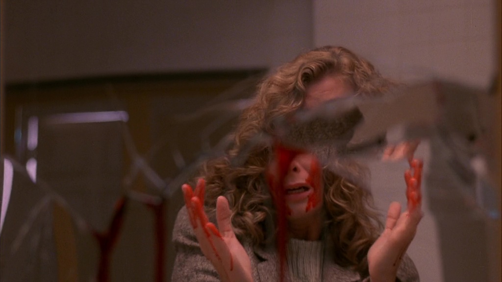
The Sender (Roger Christian, 1982)
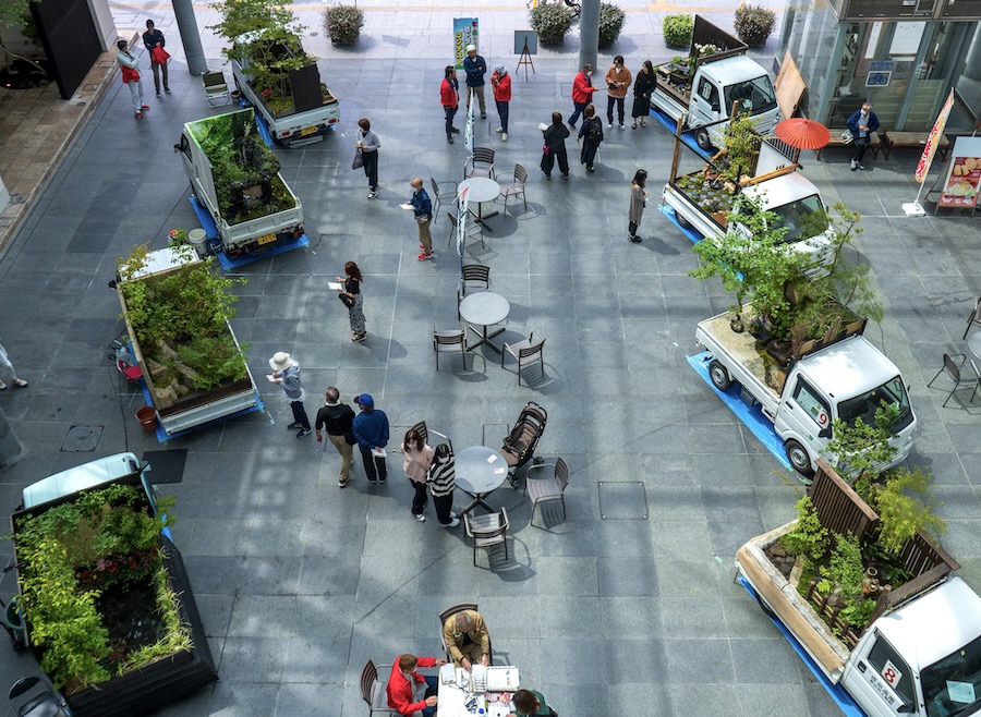
A contest where professional gardeners create small gardens and landscapes on beds of their kei trucks. Very Japanese.
via Spoon & Tamago
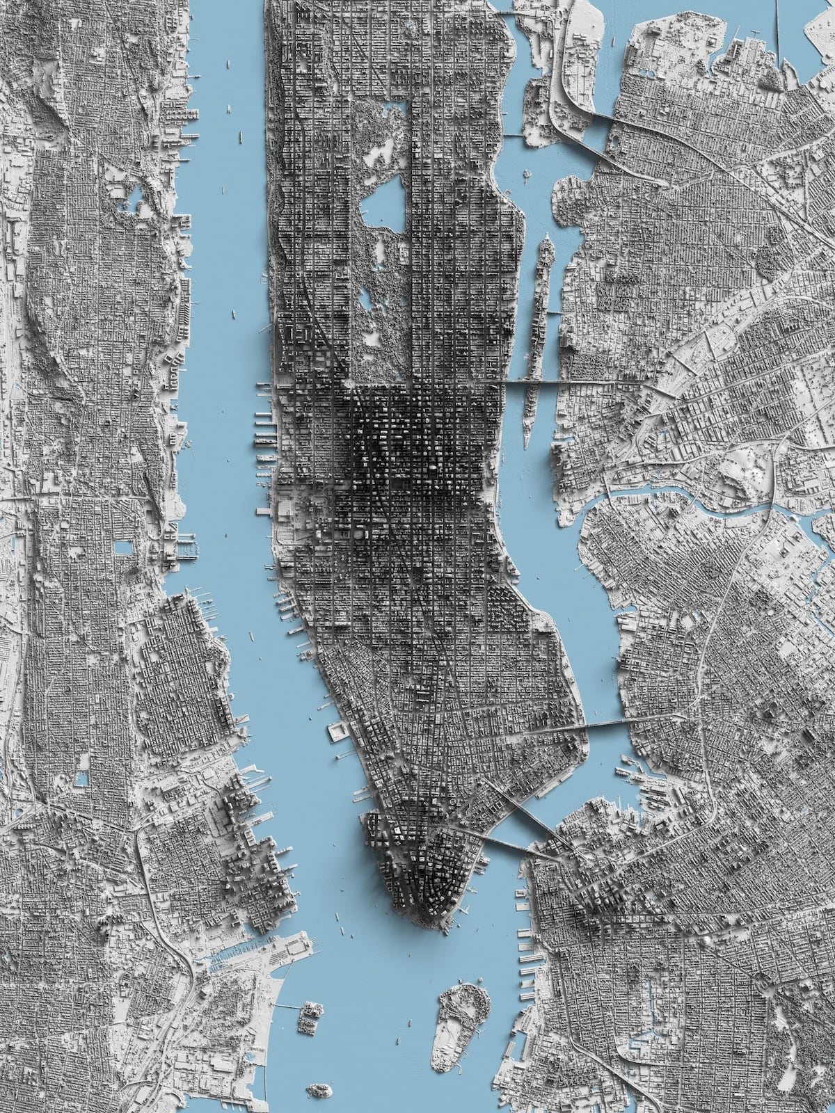
From Reddit user r/Kittyhawk, a shaded relief map of Manhattan, made from LiDAR data. Hop to Reddit to view the full-resolution image.

A wild-looking building, the Prinkipo Greek Orphanage in Turkey. The largest wooden building in Europe and second argest in the world. Side view photo by Reddit user u/frkkn.
Collected bits and pieces I’ve noticed this month.
The Bento method of productivity – pick 3 things, large, medium and small, to work on today, and complete them one by one in whatever order. Done, done, done.
~
User Hostile Experience is a bit ranty, perhaps, but who doesn’t feel ranty when slapped in the face with a “subscribe to my newsletter” the first time you meet someone.
~
Every day for the past 21 years, photographer Noah Kalina has taken a selfie. He’s compiled them all into a video titled “7777 days” that condenses half of his life into 2 minutes.
via Kottke
~
I loved this description how poet Ruth Stone “catches” poems. I remember Rick Rubin talking about a similar thing in his book The Creative Act – how art, be it poetry or music or painting or a photograph, exists in the world and the artist merely captures it.
“As [Stone] was growing up in rural Virginia, she would be out, working in the fields and she would feel and hear a poem coming at her from over the landscape. It was like a thunderous train of air and it would come barrelling down at her over the landscape. And when she felt it coming . . . ‘cause it would shake the earth under her feet, she knew she had only one thing to do at that point. That was to, in her words, “run like hell” to the house as she would be chased by this poem.
The whole deal was that she had to get to a piece of paper fast enough so that when it thundered through her, she could collect it and grab it on the page. Other times she wouldn’t be fast enough, so she would be running and running, and she wouldn’t get to the house, and the poem would barrel through her and she would miss it, and it would “continue on across the landscape looking for another poet.”
via Design Matters
~
Actually the line that I think was the most telling but that she said like a throw-away qualifier was “I didn’t know anyone in New York when I moved here…”
I think that is such a huge factor. To move to a city where you are not afraid to try something new because all the people that labeled who THEY think you are (parents, childhood friends) are not their to say “that’s not you” or “you’ve changed”. Well, maybe that person didn’t change but finally became who they really are.
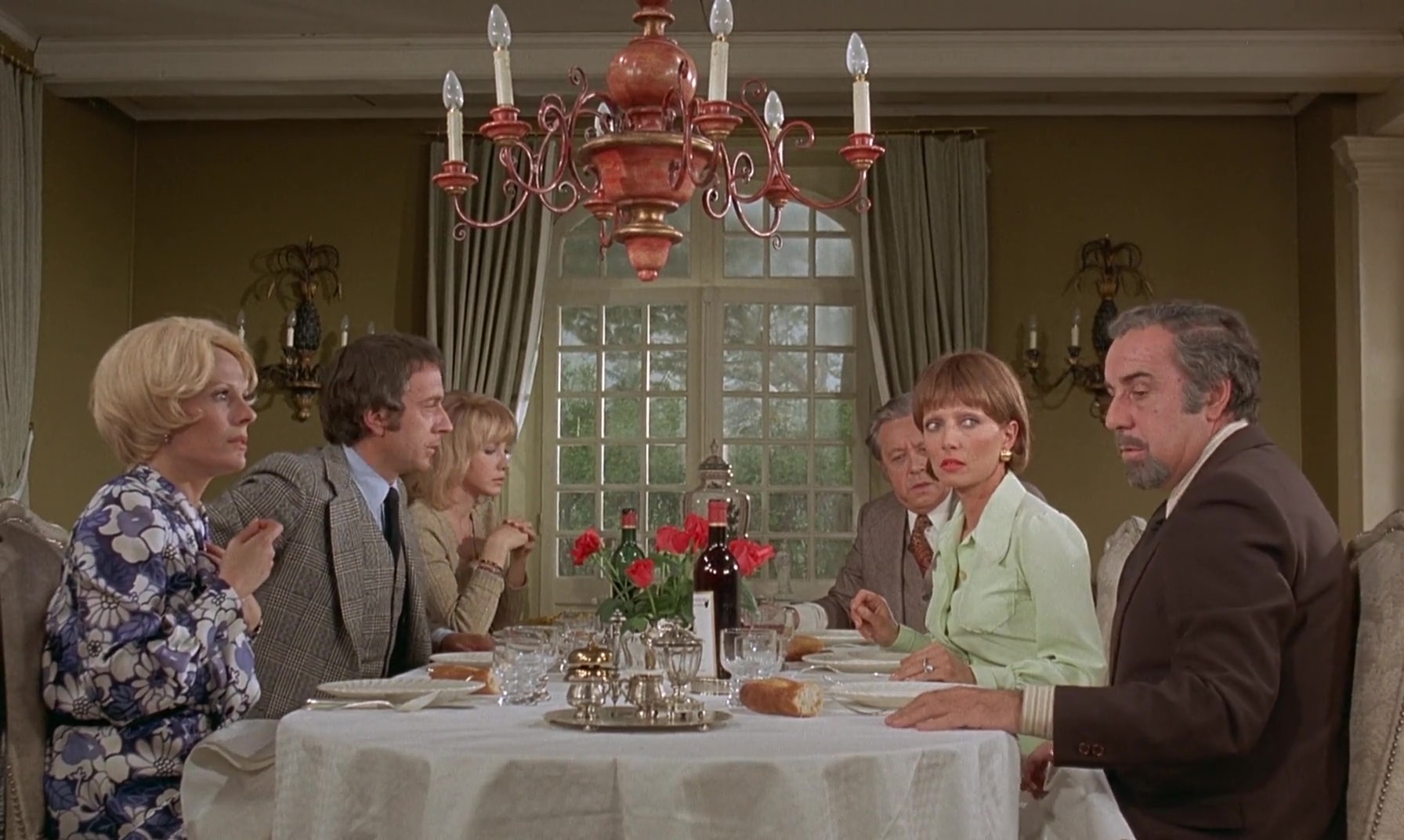
The Discreet Charm of the Bourgeoisie (Luis Buñuel, 1972)
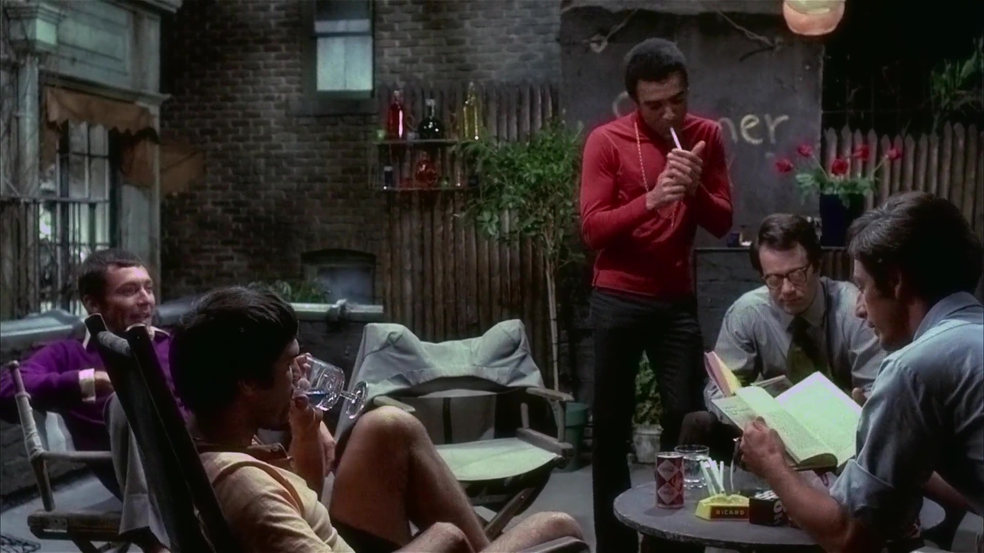
The Boys in the Band (William Friedkin, 1970)
Collected bits and pieces I’ve noticed this month.
Jasmin Paris became the first woman ever to complete the Barkley Marathons.
~
VWFNDR Keirin. I find this concept camera interesting on a few levels. On one, it’s part of what seems to be a resurgence of niche but fun-looking devices with cool design and an attitude like the Playdate game console with its single colour screen and fun crank arm, or the Rabbit R1 (not the best-reviewed, putting it mildly) – intentionally limit the funcionality and tech and force yourself to come up with novel ideas to get around these giving the device tons of personality in the process. Design loves constraints. On the other, it leverages the relative freedom a large touchscreen gives to play with new interface design ideas. I was immediately reminded of the soviet Horizon panoramic camera that utilised a unique swiveling lens to take awesome panoramic photos on regular 35mm film stock. I’m rooting for Keirin to graduate from a concept to a product.
~
I enjoyed this interview with Stefan Sagmeister on the Design Matters podcast.
~
Eye on Design has published an oral history of how the Processing programming language came to be and evolved. I made this 2001: A Space Odyssey poster with Processing.
~
Makes sense, the Helsinki Bus Station Theory of Creativity.
See also: the polish paradox.
~
“Let’s make the indie web easier” by Giles Turnbull on making it easier for people to make and run their own sites rather than installing WordPress or simply giving up. I was so put off by the “it’s easy, just (insert tech acronym salad here)” when I tried to see if some modern web tech would make building and publishing a site like mine easier.
~
And, found via Gilest, here’s Good Enough. I always like when a small team is making fun stuff.
~
I learned a few things from “12 Figma tips to work more efficiently”, maybe you will too.
via sidebar.io
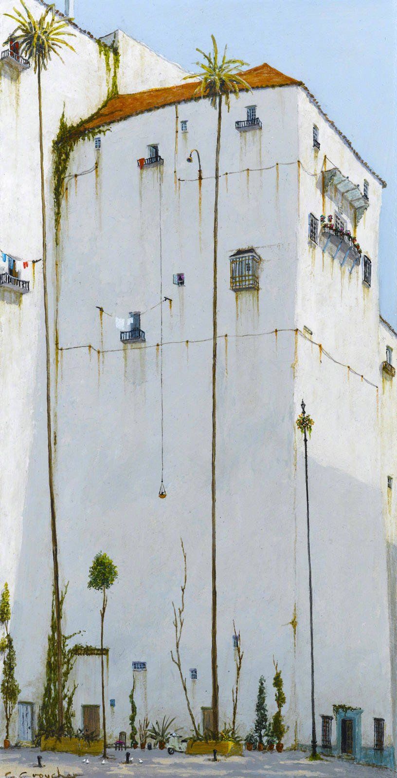
I like the art of Cyril Croucher.
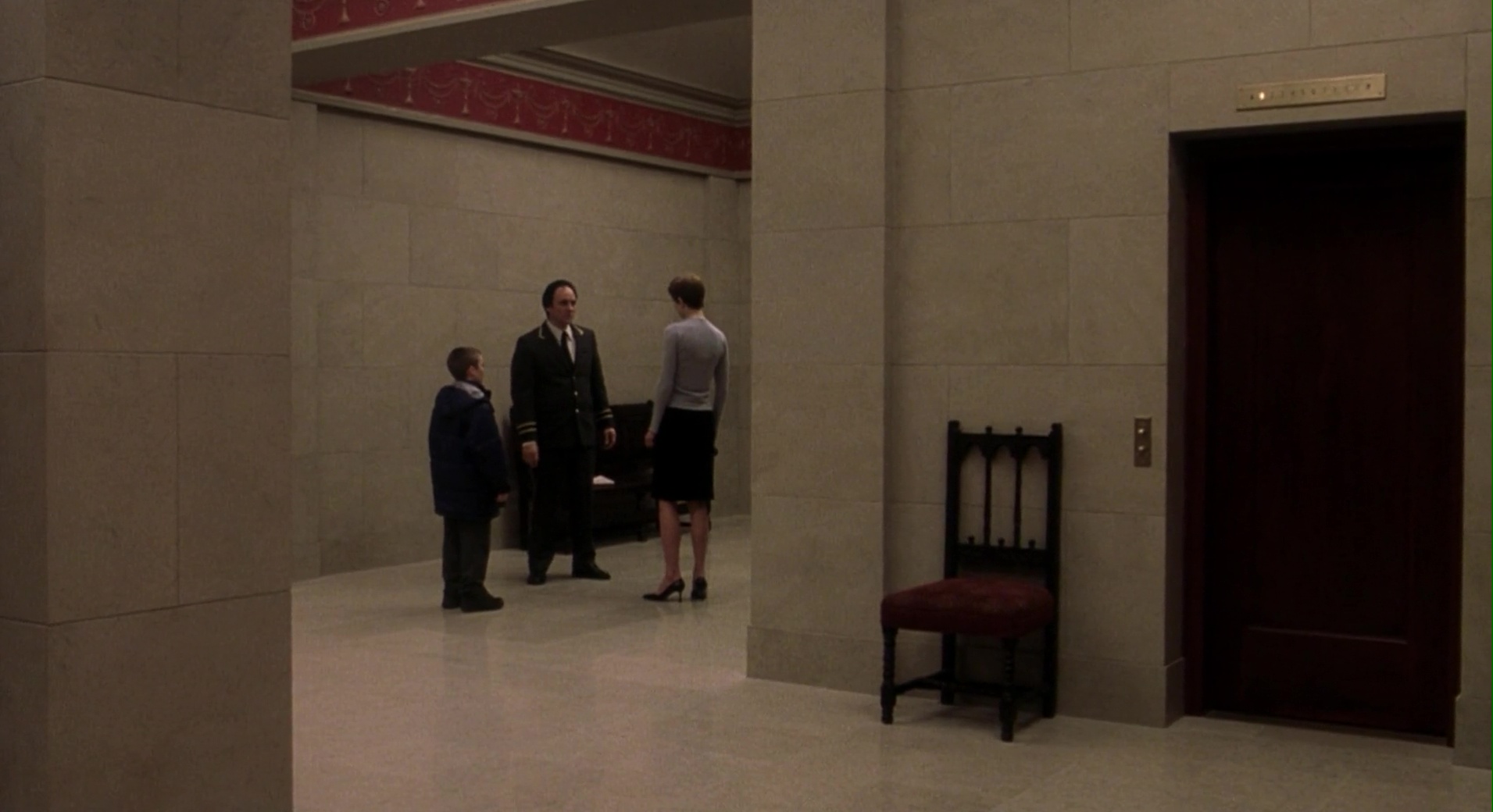
Birth (Jonathan Glazer, 2004)
Collected bits and pieces I’ve noticed this month.
In “Rethinking the startup MVP: Building a competitive product” Linear co-founder Tuomas Artman argues how it’s more and more unlikely your MVP has to prove an idea, but rather that it has to execute an idea better than the others have.
~
Legendary car designer Marcello Gandini has passed. He was the designer behind for the iconic Lamborghini Countach, an even more shard-like Lancia Stratos Zero concept car and played a part in shaping one of the most beautiful automobiles, the Lamborghini Miura.
via Wallpaper
~
“The job is not to invent, but to curate” says Josh Clark from Big Medium in “The Most Exciting Design Systems Are Boring”. Design systems should take the boring, the mundane off your (and your colleagues) hands so you can solve some new problems instead.
~
In more sad news, Tiny Letter was shut down. I miss Pome.
~
And in even more sad news, A Book Apart also closes.
~
Chris Coyer shares his thoughts on what’s going on with CSS Tricks post selling it to Digital Ocean. I learned so much from CSS Tricks and the tone of the site was so friendly and approachable, what a bummer.
~
And wrapping it up with CSS, Richard Rutter rebuilds a Creative Boom article page with no media queries, just fluid type. Cool.
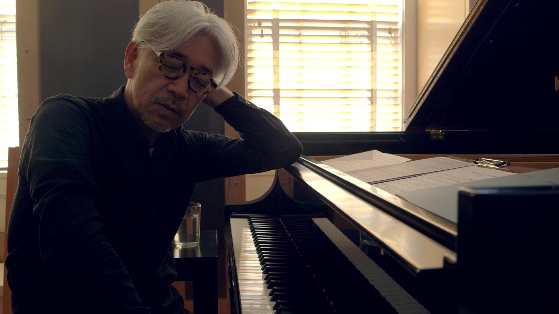
Ryuichi Sakamoto: Coda (Stephen Nomura Schible, 2017)
"And on and on — bikes. Why? Because as any bike lover will tell you, to be ensorcelled by the bike is to crave one and only one thing: More bike."
Craig Mod on (electric) bicycles.

From the Wave series by Liis Karu. There's more on her Instagram.
Collected bits and pieces I’ve noticed this month.
Like many other platforms, Letterboxd posted their 2023 Year in Review.
Maybe I’m not using as many services anymore that can compile personalised a wrapped-style look back at a year, but I feel like I’m seeing fewer of them each year, which is a bit sad.
~
Speaking of movies, here’s an over-analytical analysis of the styles (authors words) of two batman movies – The Dark Knight and The Batman – by P.J. Onori.
via Sidebar
~
What I’m seeing more of than before is lists of 52 things (one for each week) someone has learned over the past year. Last year I found a list by Kent Hendricks, most probably via Jason Kottke who this time published his own, via which I discovered Tom Whitwell's.
~
For even more lists, here’s The Atlantic’s 81 Things That Blew Our Minds and a of The Best Articles We Didn’t Publish jealousy list by Rest of World.
~
I was watching the 25th Anniversary of Half Life documentary and found Gabe Newell’s “Late is just for a little while. Suck is forever.” version of a quote often attributed to Shigeru Miyamoto – “A delayed game is eventually good, a rushed game is bad forever.” – funny and no less educational.
~
Lightbeam by Anton Repponen is a beautiful photo essay.
via Readymag
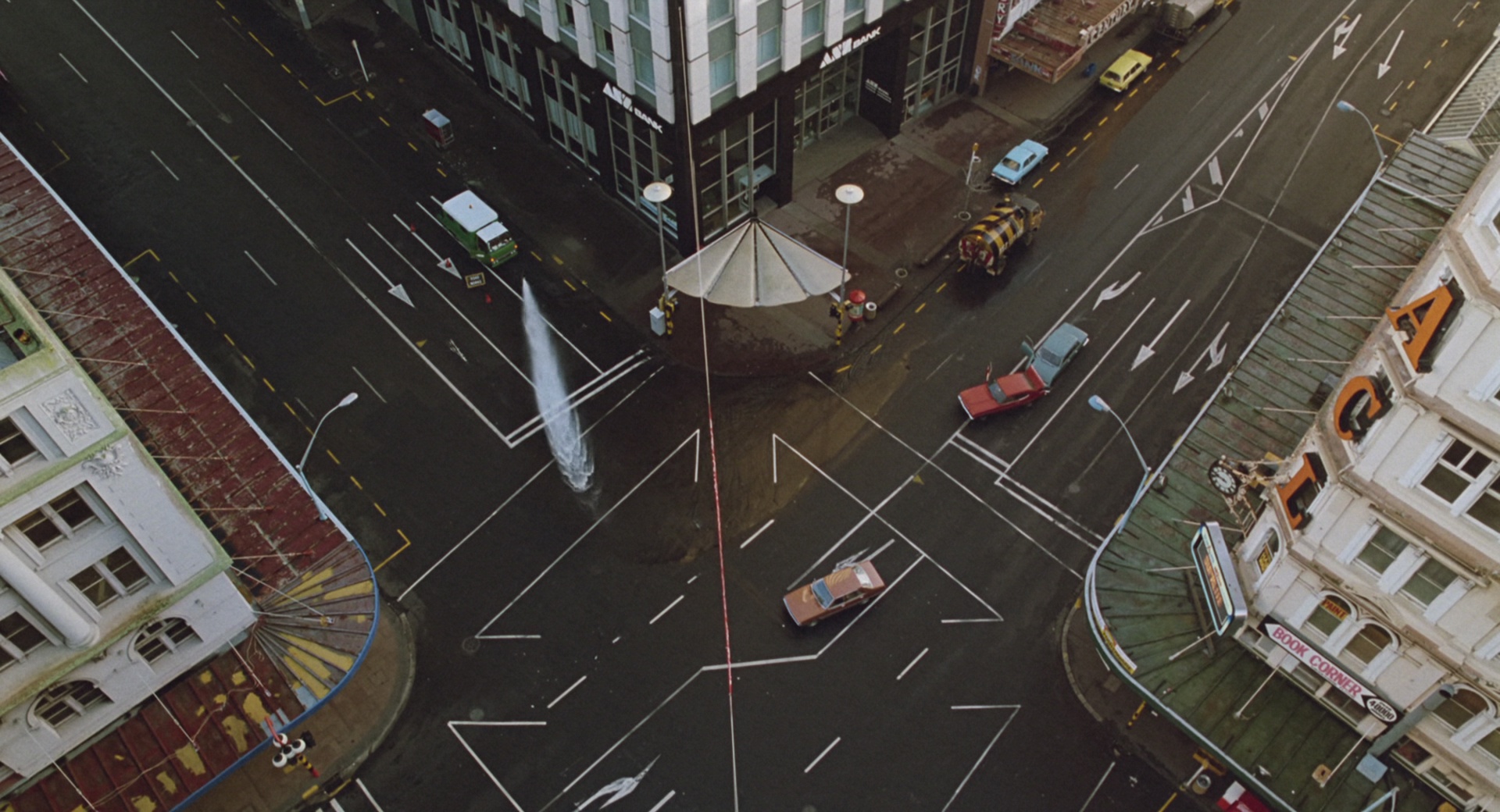
The Quiet Earth (Geoff Murphy, 1985)
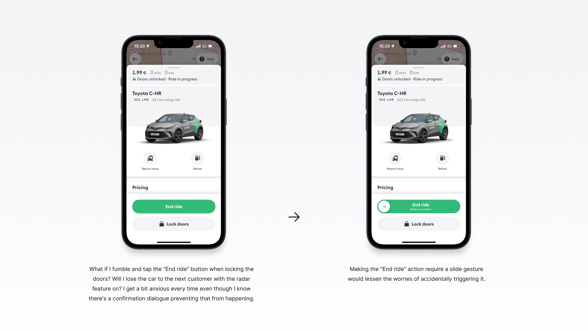
What if I fumble and tap the "End ride" button when locking the doors? Will I lose the car to the next customer with the radar feature on? I get a bit anxious every time even though I know there's a confirmation dialogue preventing that from happening.
Making the "End ride" action require a slide gesture would lessen the worries of accidentally triggering it.
That being said, this is a concept design and I'm sure designers at Bolt have considered this and have their reasons for not using this interaction pattern here. Because a slide gesture is required to unlock the doors when starting a ride and this would run the risk of muddying things too much – slide to unlock or tap to cancel at the start, tap to unlock or slide to end during a ride.

Chapelle Notre-Dame du Haut, Le Corbusier, 1955
via formlab
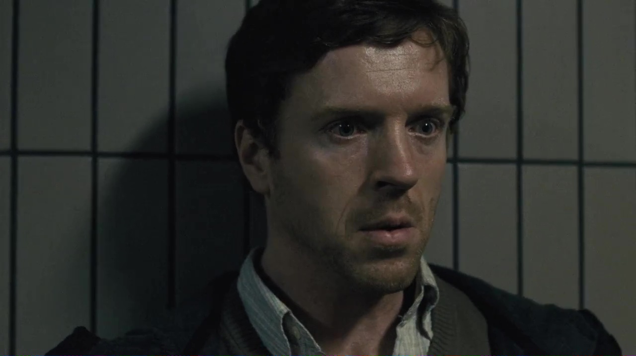
Keane (Lodge Kerrigan, 2004)