Funderbeam brand update
A refreshed, course adjusted brand and visual identity for Funderbeam.
Funderbeam had, for some time, started to serve more sophisticated investors and distanced itself from crowdfunding of startup companies, where we'd started.
By 2021, we were moving away from crowdfunding of startups towards attracting more sophisticated investors, more mature companies, and bigger deals of higher quality. The technology and product portfolio were also maturing, and all this needed to show.
Finding out what to do
First, research time. We talked with stakeholders in-house to get a clear understanding of the business goals the brand needed to support and target the clients it needed to attract.
We also wanted a temperature check on how the current brand was doing, perception-wise. To find out, we sent a short survey to our key clients and representatives of our new target client groups.
What we found was that the current brand was doing quite alright. We knew we had no major blemishes on our reputation, and the overall sentiment turned out to be rather positive. How people thought of us also matched our changed brand goals nicely. This was good news – as much as the prospect of creating something new from scratch excites me as a designer, we were strapped for time, budget, and manpower. We could now dial the scope back from a total rebrand – new name and all – and keep a lot of the positive brand equity as a foundation to build on. Instead of tearing it down, the brand needed to evolve.
Evolving the logo.
The old logo had had a good run for over six years, but was starting to show its age. I wanted the new logo to be an evolution of it, to build on our past. I also wanted to step away from the all-lowercase branding that was the style du jour for tech startups. It made sense considering our target audience.
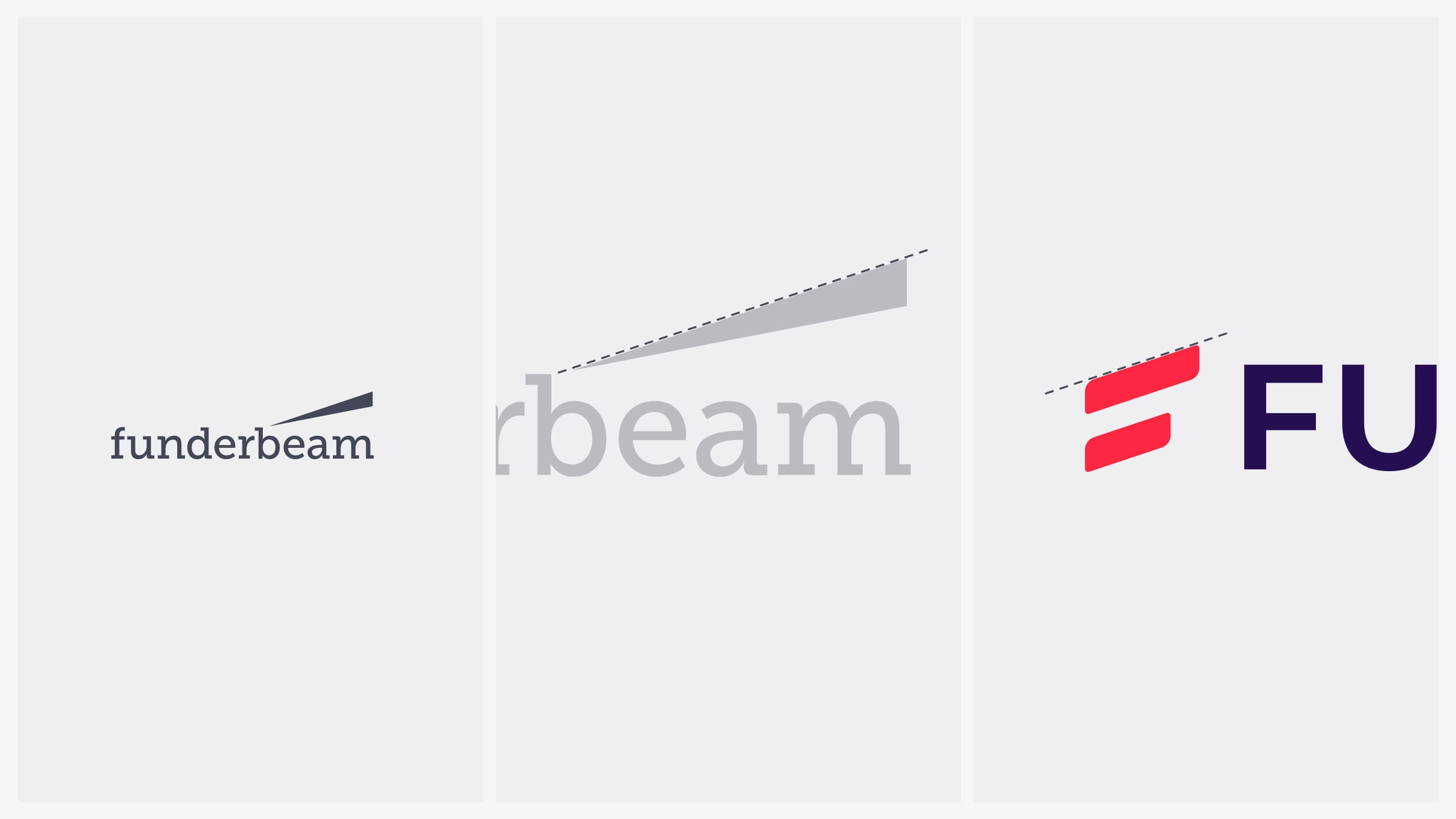
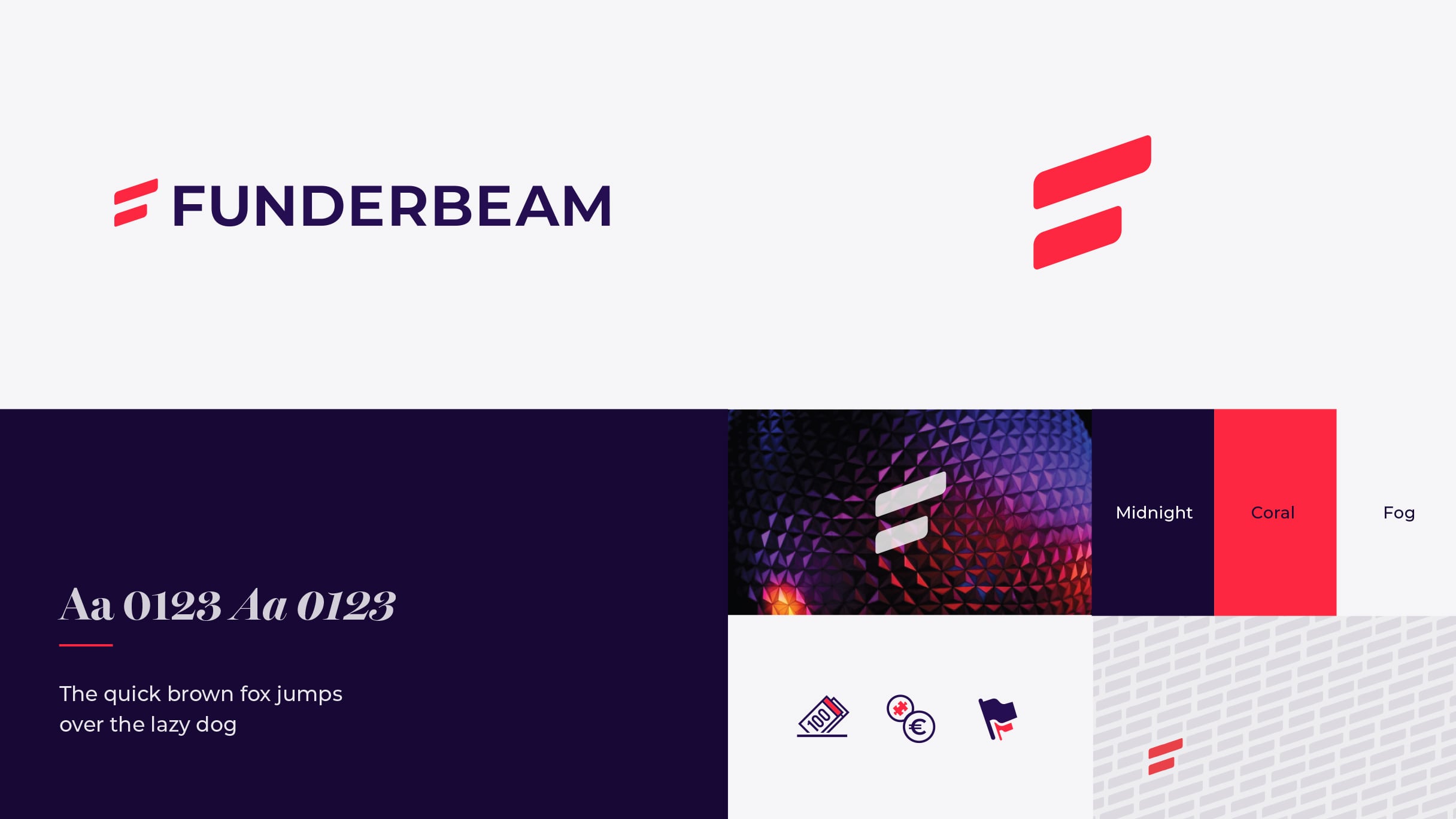
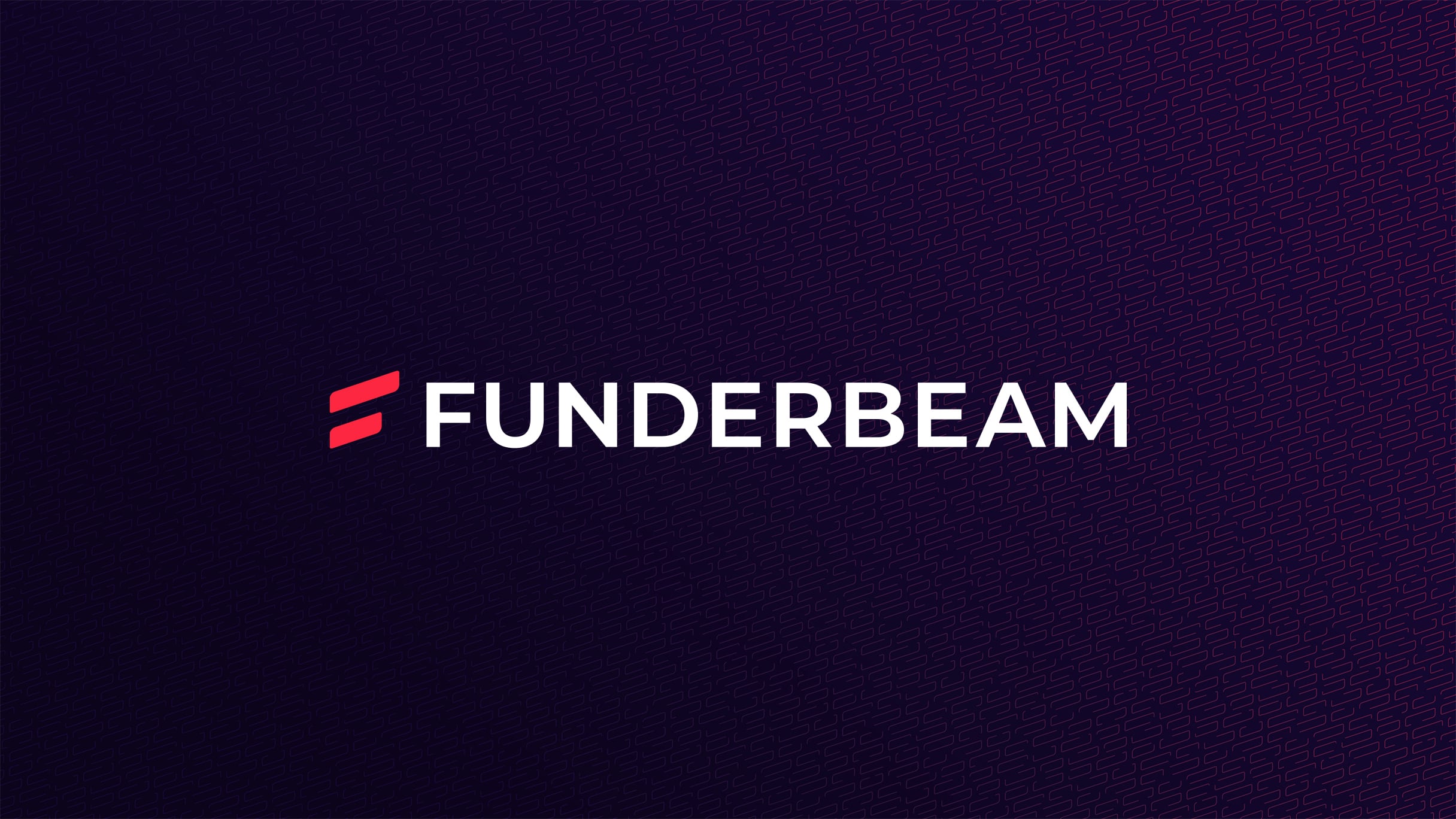
The new stylised F symbol follows the angle of the original "beam". The wordmark is based on Montserrat, with small kerning and weight tweaks. The new logo is also blockier and much easier to visually balance in layouts.
The icon had to work alone better than the old one – the old f was too much like Facebook’s, and the beam felt too lightweight. It needed to pack more punch.
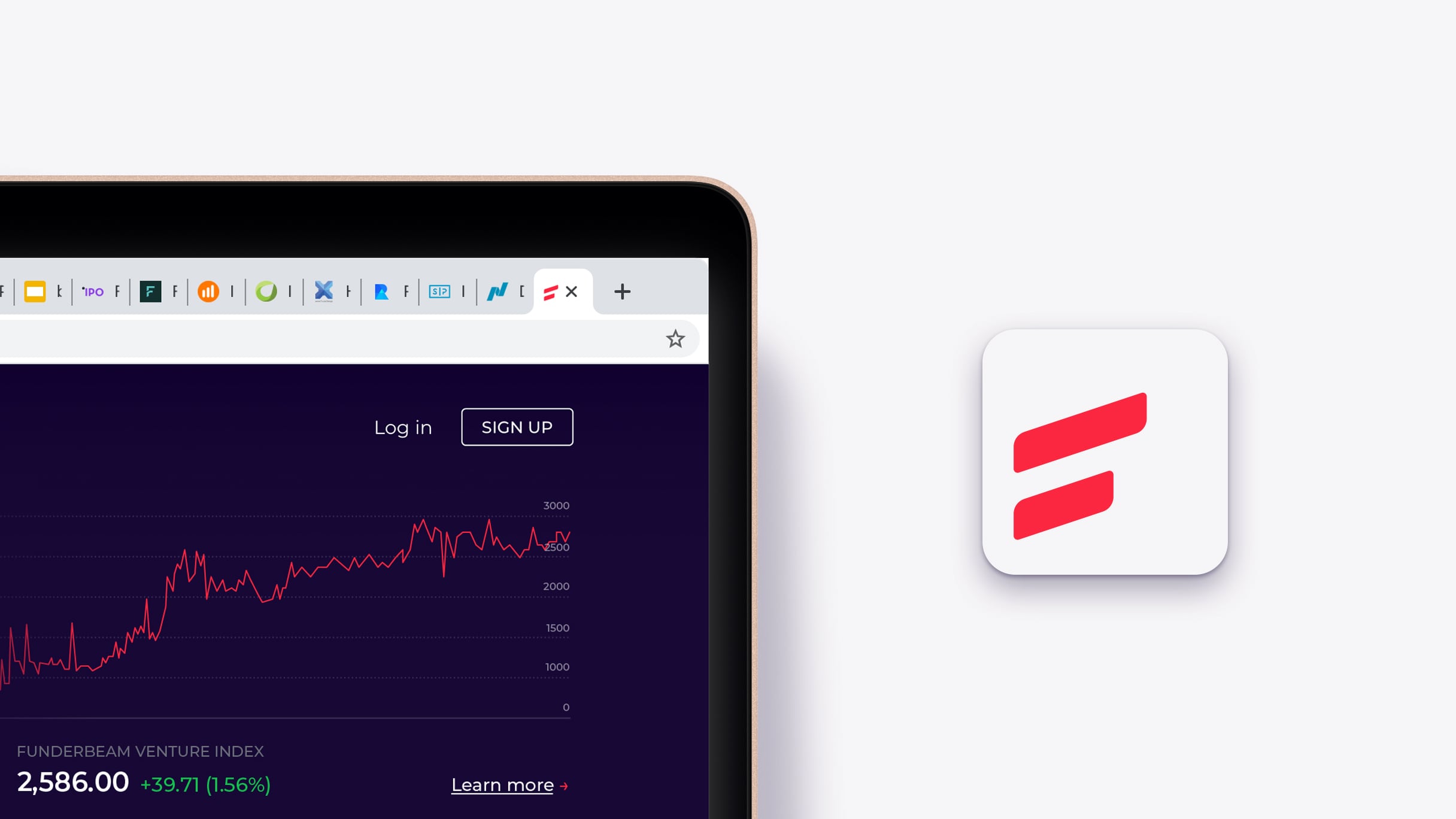
The new icon scales better, can be turned into patterns for branded fills, and can work as a framing device in layouts.
Evolving the visual language
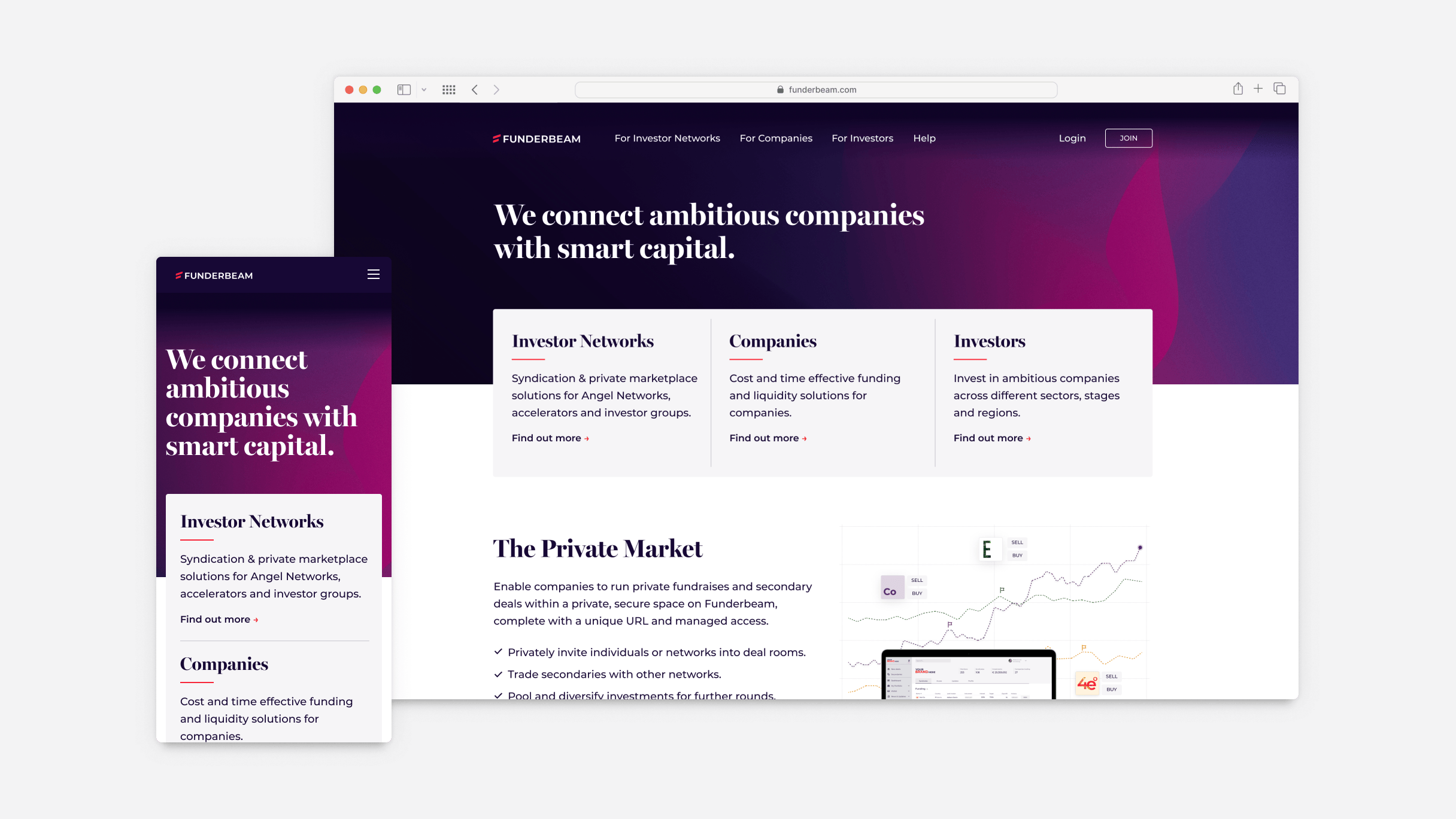
The visual identity of Funderbeam has evolved constantly over the years. A couple of years back, we changed to a darker main blue colour accompanied by the hot pink of the beam and some cool greys. The pink needed to grow up – it took a step towards red, got a bit deeper, and still serves as a vibrant accent.
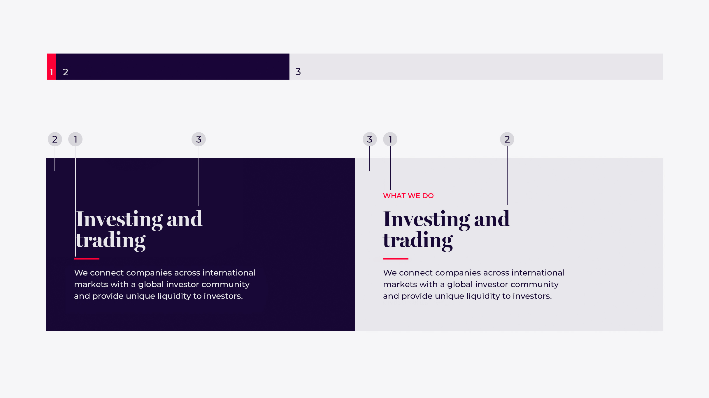
The layouts and supporting graphics got a bit cleaner and more polished. I built a set of Figma templates among other tools that made it easy for marketing to produce on-brand-looking artwork with just a few clicks.
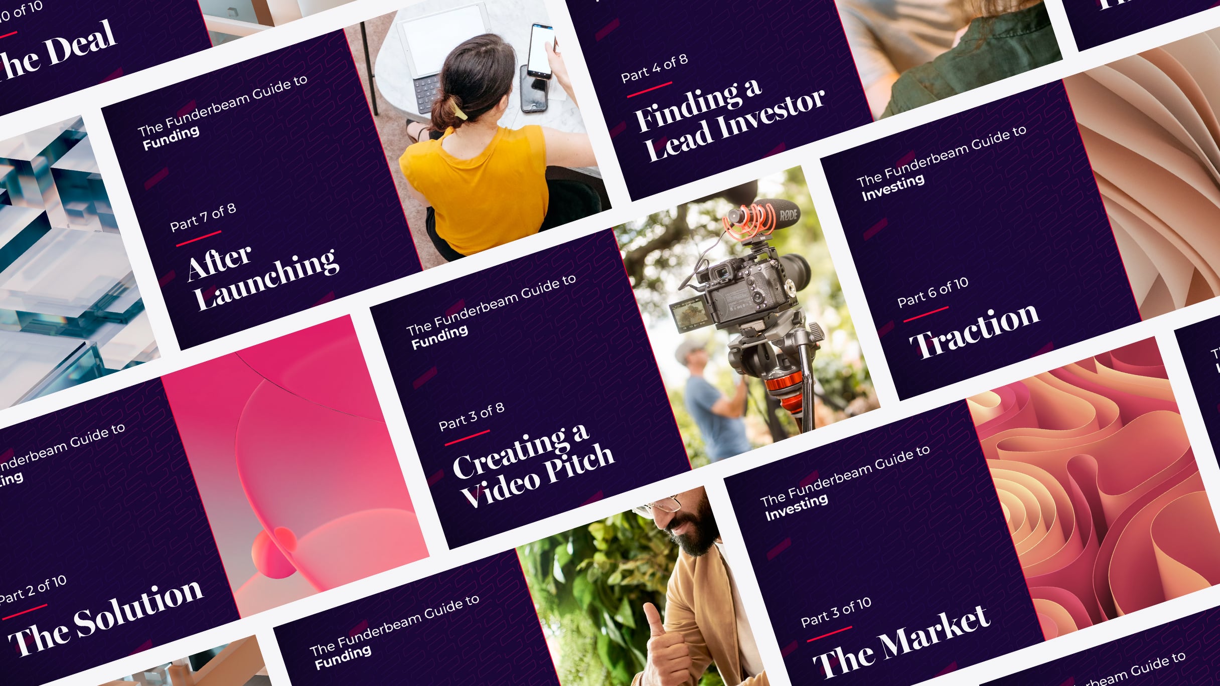
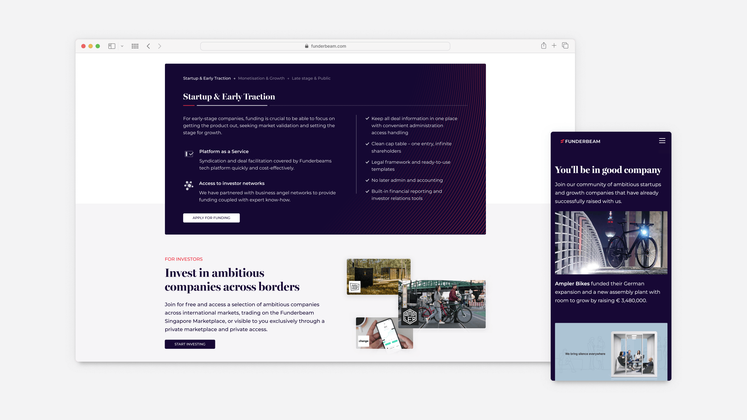
The layout patterns, guidelines and systems of combining elements were largely informed by my own experience working with the brand and addressed some pain points and time wasters.
Evolving how we speak.
We operate in the financial world, and people trust us with their money, so we’ve had our voice and tone dialed accordingly since day one. We just needed to adjust it a little to speak the language of the clients we wanted. Part of the new brand book’s language section was a vocabulary chapter on how and, just as importantly, why we speak and write the way we do going forward. As an example, a classic crowdfunding round is called a campaign. The new Funderbeam does not do campaigns, we would not be drumming up support, but instead will be offering investors opportunities.