A running collection of things I’ve found interesting, well-made, or worth spreading—mostly from art, design, tech, photography, and film, with the occasional thought or two of my own.
Collected bits and pieces I've noticed this month.
Signal ad campaign reveals creepy tracking, gets them banned
The secure, privacy focused messaging app Signal created a series of ads that cleverly exposed the data Facebook has on you to target the advertising you see. You'll never see these ads on Instagram though, cause Facebook swiftly banned Signal's ad account.
I loved this last bit:
So, here are some examples of the targeted ads that you’ll never see on Instagram. Yours would have been so you.
NFTs Weren’t Supposed to End Like This
Anil Dash writes about the origins of NFTs and how the original ideas behind it were, let's say, more noble than the inevitable reality of most things tech and crypto.
The idea behind NFTs was, and is, profound. Technology should be enabling artists to exercise control over their work, to more easily sell it, to more strongly protect against others appropriating it without permission. [...] But nothing went the way it was supposed to.
Bertone porn
This Docubyte ministe celebrating (mostly, I think?) Bertone designed concept cars is gorgeous. Check out their other stuff as well.
Create better links
A link is a promise, not a surprise.
Rian Rietveld writes at length about creating better links on the web from choosing better copy instead of "Click here", to design considerations for better accessibility.
Create better anchor links
More link talk from Amber Wilson, this time about crafting better anchor links and the accessibility pitfalls to look out for.
Portfolio update
Almost forgot, I created a little logo for a food truck called Van Der Fritt.
"My approach to what I do in my job — and it might even be the approach to my life — is that everything I do is the most important thing I do. Whether it’s a play or the next film. It is the most important thing. I know it’s not going to be the most important thing, and it might not be close to being the best, but I have to make it the most important thing. That means I will be ambitious with my job and not with my career. That’s a very big difference, because if I’m ambitious with my career, everything I do now is just stepping-stones leading to something — a goal I might never reach, and so everything will be disappointing. But if I make everything important, then eventually it will become a career. Big or small, we don’t know. But at least everything was important."
"Waves of Abandonment" The number of neglected abandoned oil wells in Texas alone is startling, the result of lax regulation and jerks running oil companies.
Collected bits and pieces I've noticed this month.
Terminal bonsai
John Allbritten created this little thingumbob that lets you grow a bonsai tree in a terminal window.
The difficulty of doors in video games.
I don't think I've ever given much though to doors in video games, unless they act real weird - badly designed doors are just as annoying in video games as they are in real life. Well designed doors on the other hand should be forgettable and achieving this in a video game is harder than you might think. "Why game developers can’t get a handle on doors", The Verge
The booze shader
Another thing that's hard to get right in video games is liquids and still stay within a reasonable performance budget. Vfx developer Matt Wild nailed it for Half-Life: Alyx, I especially loved this clever bit of performance optimisation:
“When I shake a bottle, [the liquid] kind of wobbles around a bit. So we make it wobble around a bit, inasmuch as the wobble looks about right.”
It’s this wobble that initially delayed the shader, as there wasn’t an efficient way to get the information into the game. In the end, the performance cost was negligible, because Wilde’s colleagues at Valve realized they could store data in the shader’s vertex color.
I've long been of the opinion that modern design tools are lacking or perhaps even misguided. While I admit that big strides have been made in reducing the amount of work designers have to do to get an idea to a working product, we are still largely making pictures of apps and websites. It's much easier these days to link these pictures to quickly prototype an idea and describing specs for developers has largely been automated, but at the end of the day it's still pictures of apps and websites.
I was reminded of this again when I came across this article by Carol Chan on how to construct complex variants in Figma. I mean, 288 card header variations? Sure, a card header may very well have this many variations and the design should be robust enough to handle them elegantly, but there must be a more effective way to go about this. Working closer to actual code and trying to break the component while testing and then iterating on it perhaps, not making 288 pictures of the component.
File that one under unexpected — Liz Stinson writes on Hodinkee how among stellar examples of watch face typography like Hermès' beautiful custom numbers, there are some rather 'meh' approaches from otherwise big names like Rolex, but this one certainly takes the cake:
Patek Philippe, for example, has used ITC American Typewriter and Arial on its high-end watches.
A new study sheds some more light on the doorway effect, that pesky phenomenon of walking from one room to another and completely forgetting why you came here in the first place. It seems our brains ability to compartmentalize comes with a minor downside:
The researchers suggest that it's not so much the doorways that cause a memory wipe, as moving from one location to a significantly different one – it's the abrupt change of scene that primes our minds to receive something new.
No, that's not a typo. Aloneliness, unsurprisingly to me at least, is a thing — it's the negative emotions that come from not spending enough time alone.
As social beings, people depend on having other people around them to interact and connect with to avoid becoming lonely, another, much researched psychological phenomenon.
But some people, more than others, need regular spans of solitude to feel mentally balanced and re-energized, to avoid stress and, eventually, depression.
The researchers recommended deliberately planning or scheduling time alone in order to avoid what they call a "negative degenerative cycle." They explained that when your need for solitude gets continually thwarted by the stress of competing demands on your time (or space), the result is an increase in feelings of aloneliness, which then increases stress and life dissatisfaction. This negative cycle can exacerbate internalizing symptoms (e.g. depression).
Know, that it's perfectly okay to want to be by yourself from time to time.
(via BoingBoing)
After 200 years, a new shade of blue called YInMn Blue (for yttrium, indium, manganese) has been discovered.
In the sixth chapter of the Web History series for CSS Tricks, Jay Hoffmann focuses on the early days of designing for the web. Brings back memories, good and bad.
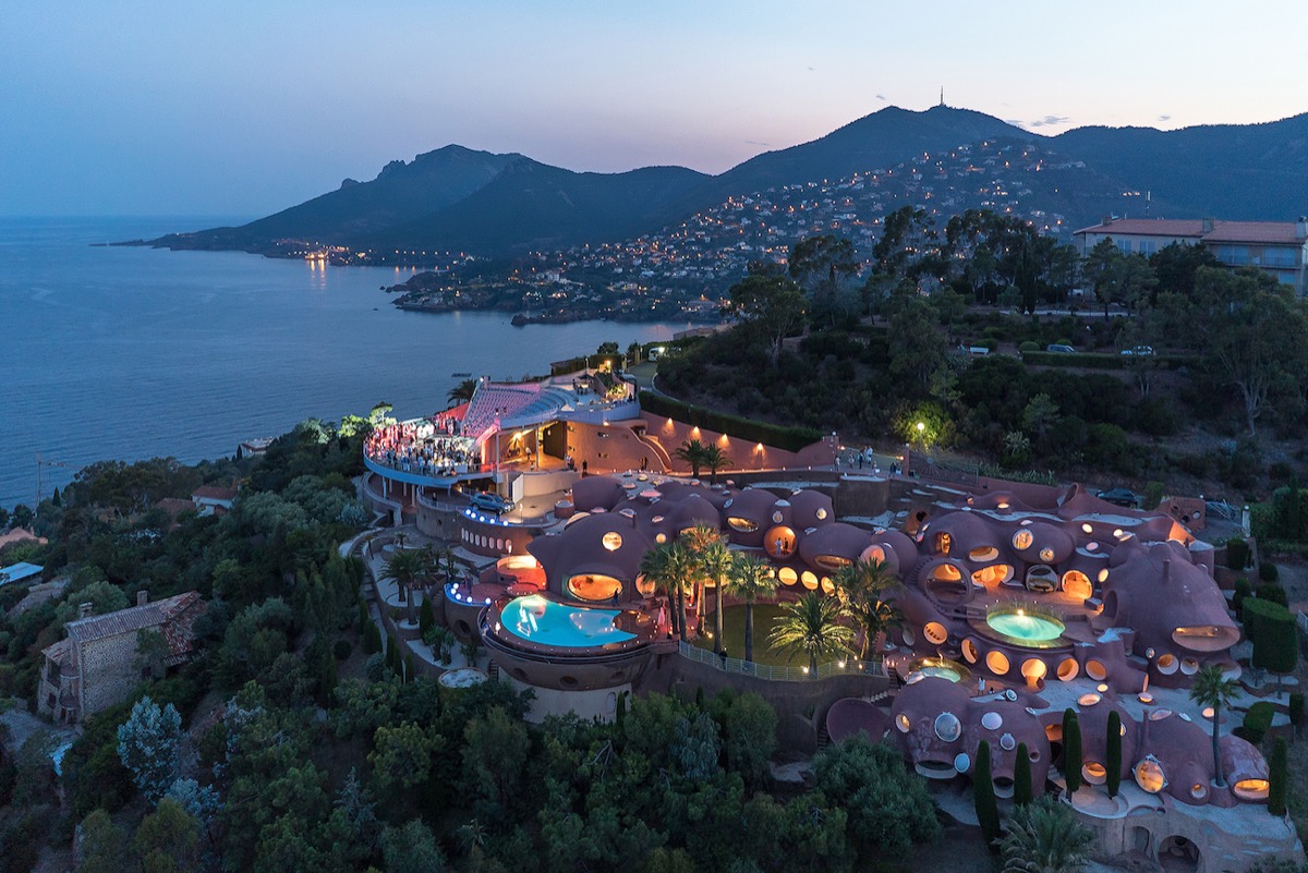
The wonderfully weird estate that belonged to late designer Pierre Cardin and is known as Le Palais Bulles or 'the bubble palace', sits on a mountainside in Cannes overlooking the Mediterranean. Complete with (at least) two pools and an amphitheater it's on the market with a £300 million price tag.
via Home Designing
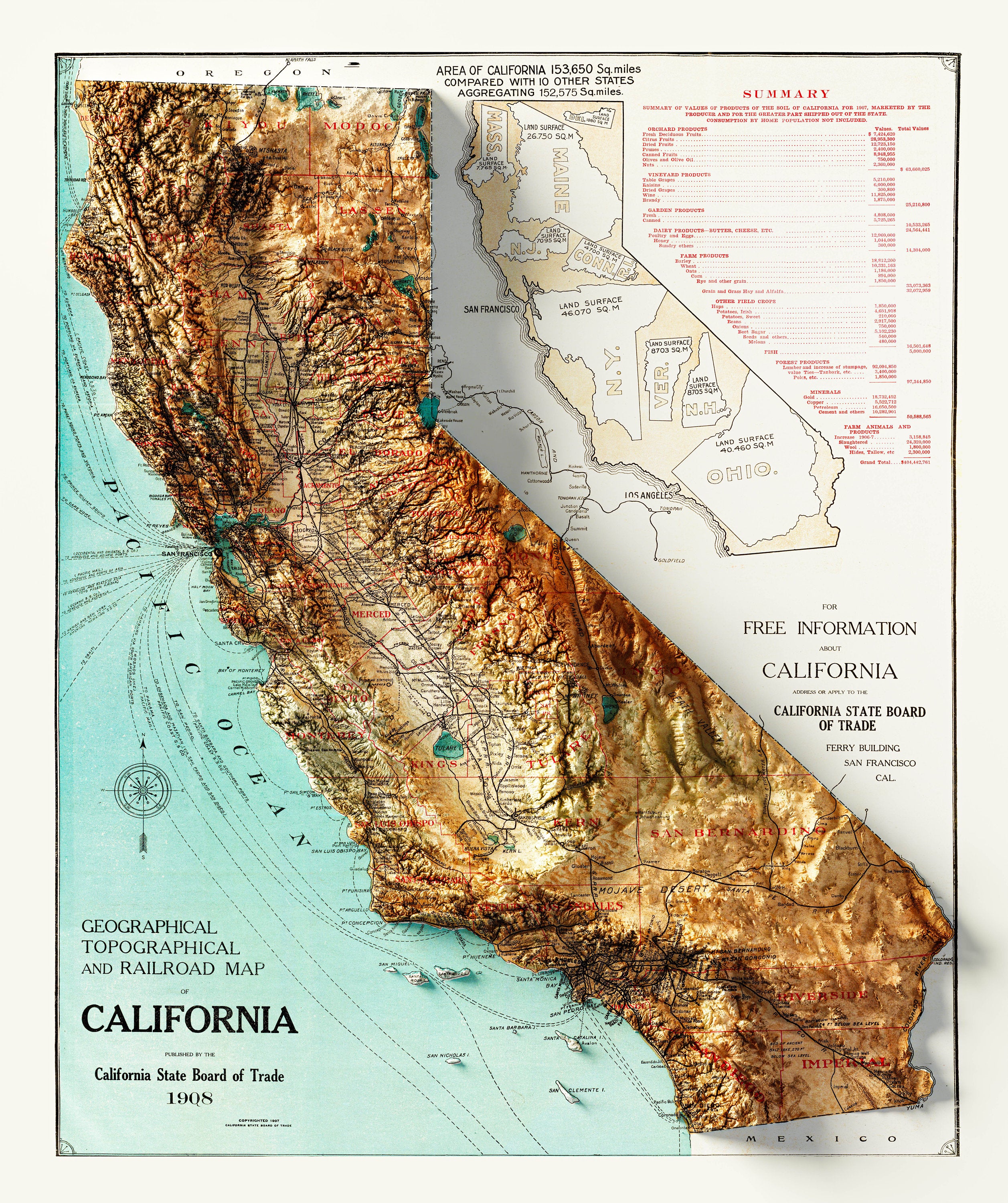
This guy Liam makes super cool topographic 3D maps. Here's his Etsy shop and Instagram.