A running collection of things I’ve found interesting, well-made, or worth spreading—mostly from art, design, tech, photography, and film, with the occasional thought or two of my own.
No, that's not a typo. Aloneliness, unsurprisingly to me at least, is a thing — it's the negative emotions that come from not spending enough time alone.
As social beings, people depend on having other people around them to interact and connect with to avoid becoming lonely, another, much researched psychological phenomenon.
But some people, more than others, need regular spans of solitude to feel mentally balanced and re-energized, to avoid stress and, eventually, depression.
The researchers recommended deliberately planning or scheduling time alone in order to avoid what they call a "negative degenerative cycle." They explained that when your need for solitude gets continually thwarted by the stress of competing demands on your time (or space), the result is an increase in feelings of aloneliness, which then increases stress and life dissatisfaction. This negative cycle can exacerbate internalizing symptoms (e.g. depression).
Know, that it's perfectly okay to want to be by yourself from time to time.
(via BoingBoing)
After 200 years, a new shade of blue called YInMn Blue (for yttrium, indium, manganese) has been discovered.
In the sixth chapter of the Web History series for CSS Tricks, Jay Hoffmann focuses on the early days of designing for the web. Brings back memories, good and bad.
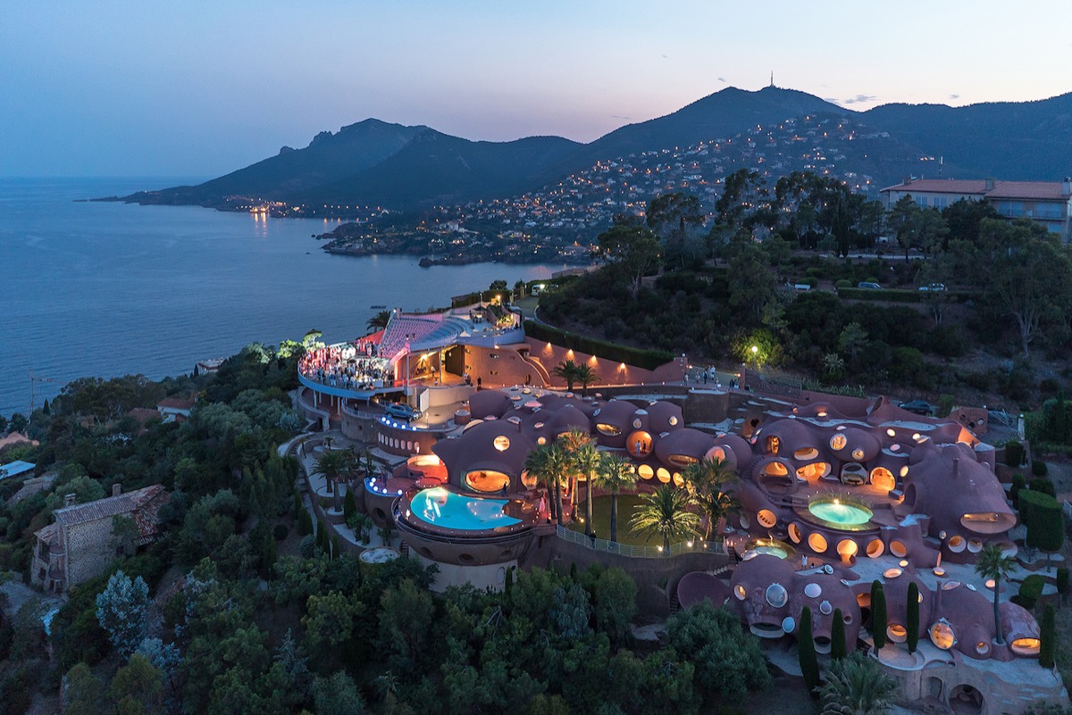
The wonderfully weird estate that belonged to late designer Pierre Cardin and is known as Le Palais Bulles or 'the bubble palace', sits on a mountainside in Cannes overlooking the Mediterranean. Complete with (at least) two pools and an amphitheater it's on the market with a £300 million price tag.
via Home Designing
This guy Liam makes super cool topographic 3D maps. Here's his Etsy shop and Instagram.
A fun read on the history of Penny Dreadfuls - cheap, easy to read, mostly pulpy fiction - and Murder Broadsides - one-sided sheets printed and sold in time for executions, recounting the crimes of the condemned.
From the article:
Enter the penny dreadful, typically eight or sixteen pages, printed on cheap paper, taking its serialized story cues from gothic thrillers of the previous century. Most of the stories are now forgotten, but one notable exception is everyone’s favorite homicidal barber, Sweeney Todd.
All with a generous sprinkling of type nerdery, as you'd expect from I love Typography. Come for the macabre, stay for the type. Go read Penny Dreadfuls & Murder Broadsides on ILT.
Collected bits and pieces I've noticed this month.
There were quite a lot of high profile rebrands recently, good and... no good.
The good: Burger King
Not sure: CIA and KIA
The no good: GM
More good: Midi, the hugely important audio technology from 1981 has now reached version 2.0 and Pentagram created a very cool new brand to go with it.
The new amazon app icon is not a white square with a single color logo and it's already the butt of hipster Hitler jokes. Because, internet.
This post on hyphenation on the web by Richard Clagnut is almost two years old now, unfortunately pretty much nothing here can actually be used. A bit more control over hyphenation without reaching for Javascript qould be nice is all I'm saying.
A fascinating story in New Yorker magazine on redesigning sugar. There's currently two competing approaches to reducing the harmful effects of sugar while keeping the taste benefits as well as the important role sugar plays in baking—artificial sweeteners fail to deliver the crumbling important in certain types of pastries.
One approach is mixing sugar with indigestible, but effectively harmless additives like silica, or changing the make-up of the sugar molecules just enough change how it's metabolised:
"Each silica grain is less than a fiftieth the diameter of human hair—invisible to the eye and undetectable on the tongue. DouxMatok’s production process embeds them throughout each sugar crystal, like blueberries in a muffin. /... / The atoms in a sucrose molecule are usually stacked in a well-ordered lattice, but when this structure becomes what scientists call “amorphous,” its atoms frozen in random chaos, it dissolves on the tongue much more quickly. Incredo’s exponentially more soluble structure rapidly saturates your taste buds, delivering an intense hit of sweetness."
The other is finding a different enough kind of sugar that the human body doesn't quite know how to approach:
"Allulose caramelizes, it fluffs, it stabilizes, and it delivers both mouthfeel and crumb structure in baked goods. “It behaves like a sugar because it is one,” Carr said. Yet, despite the fact that this rare sugar behaves almost exactly like sucrose in the kitchen, it remains sufficiently alien to pass through the human intestine without being digested or fermented."
There might just be another way by simply gradually reducing the amount of it, much like it's been gradually increased for tens of years:
Hampton mentioned that, before he came to Tate & Lyle, he worked at PepsiCo, where he managed to cut salt levels in British potato chips by half during a five-year period, without anyone noticing. “Can you do it with sugar as well? That’d be interesting,” he said.
John Boardley of I Love Typography has collected his favourite typefaces from 2020 and not only are there some sweet typefaces to feast your eyes on, the page itself is all candy as well. Pictured here are some details of Signifier from Klim Type.
Dina Litovsky's photo series of the Amish on vacation.
Glenn Fleishman in a fascinating story for Wired that involves the Prime minister of Pakistan, Justin Timberlake, a rabbi and typography.
The prime minister’s daughter, Maryam Sharif, provided an exculpatory document that had been typeset in Calibri—a Microsoft font that was only released for general distribution nearly a year after the document had allegedly been signed and dated. While Sharif’s supporters waged a Wikipedia war over the Calibri entry, type designer Thomas Phinney quietly dropped some history lessons about the typeface on Quora, and found himself caught in a maelstrom of global reporting. Phinney said that because Calibri has been in use for several years, people have forgotten that it’s a relatively new font.
Greg Girard’s photos from inside the infamous (since demolished) Kowloon Walled City in Hong Kong.